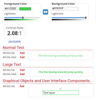
Pale green links on the pyside Qt for Python documentation website pages are difficult to read. For example the contents https://doc.qt.io/qtforpython/contents.html.
The Web Content Accessibility Guidelines (WCAG) 2.1 Success Criterion 1.4.3 Contrast (Minimum) recommends:
The visual presentation of text and images of text has a contrast ratio of at least 4.5:1
https://www.w3.org/TR/WCAG21/#contrast-minimum.
Using an online contrast checker, we can see how Qt documentation fails to meet that criteria.

I initially raised this issue on the Qt forum where it was recommended that a bug report be created. A suggested solution was to switch the link colours in the CSS between dark and light themes. This would meet the contrast standards for accessibility.
