-
Suggestion
-
Resolution: Unresolved
-
P2: Important
-
None
-
QDS 3.2
Qt DS uses in-app help to display context help and show path to tutorials.
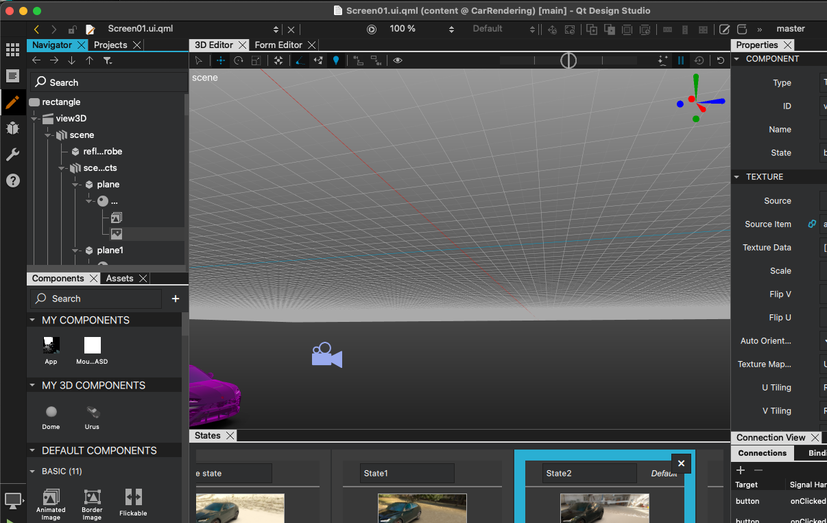
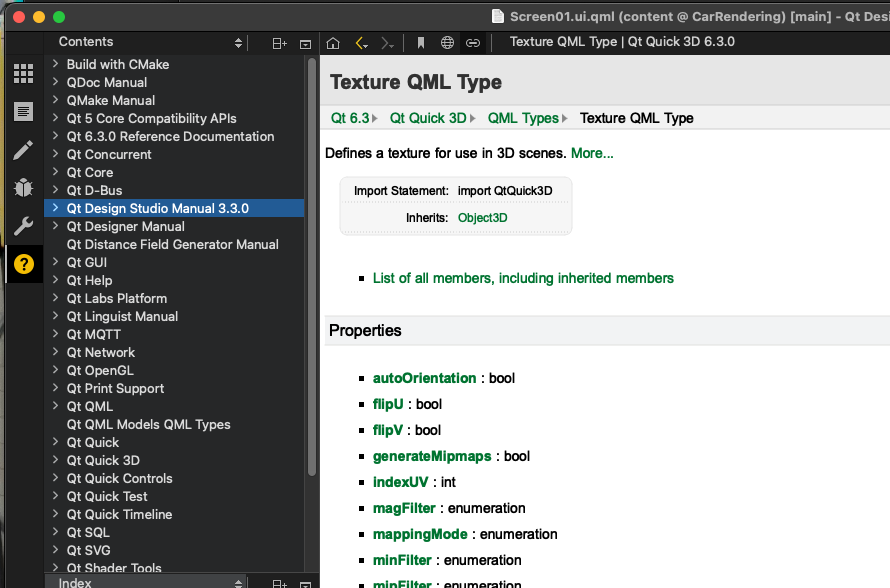
Context help is invoked by pressing F1 and then help page is opened on top of the screen. There option to open it in window or split window but default is to open fullscreen. This leads to bad UX :

Press F1 here and you end up with:

Overall with internal help there are things to improve on multiple levels:
1) opening fullscreen view on top of Qt DS project makes user (esp. new user) lose view of their project (you need to know you need to click on the 'wand' on right-hand view)
2) by default help shows contents and index, thus listing lot of C++ API related things. These are exactly things you are afraid if you're a designer.
3) Navigation on the internal documentation is not at same level as with webview version
4) UX with in-app help (icon sizes, tooltips etc) are small and cumbersome to use
5) We cannot update in-app help on the fly if we have errors there.
By using mainly the web-view helps we would easily
a) improve the UX (not losing view of your project)
b) use the latest help toolchain (it looks great!)
at least.


