-
Bug
-
Resolution: Unresolved
-
 P3: Somewhat important
-
None
-
6.3.0 Beta2, 6.4.0 FF
-
None
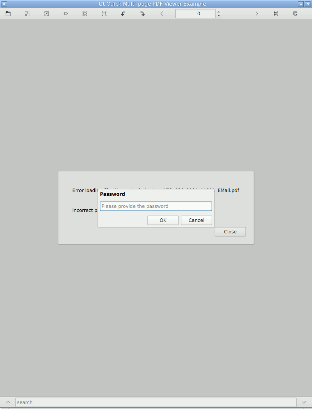
In QtPdf examples I have two dialogs: a password dialog (which must be a Dialog because we don't have a dialog for asking the user a question with a text entry field in QtQuick.Dialogs yet), and a dialog to show the error message if something goes wrong during loading. Since I'm trying to "be declarative" and show the error dialog whenever there is an error, the result is when the document cannot be opened because the password is not yet given, that's an error, and the error dialog is shown. On top, there is a password dialog at startup. When the user enters the correct password, the error is gone and the error dialog disappears.
That's OK as long as they are plain Dialogs, the same size and with deterministic z-order: one covers up the other. But MessageDialog is unnecesarily large, so if I switch https://codereview.qt-project.org/c/qt/qtwebengine/+/396319 , it doesn't look good. Which makes me wonder: why is it that large? Even on its own, it looks abnormal.
Even if I want to standardize it to make them both look that way (ugh), should we share the numbers for "standard" margins and spacings somewhere instead of just hard-coding 16's and 20's?
| For Gerrit Dashboard: QTBUG-100938 | ||||||
|---|---|---|---|---|---|---|
| # | Subject | Branch | Project | Status | CR | V |
| 396319,4 | QtPdf: use MessageDialog in examples | dev | qt/qtwebengine | Status: NEW | 0 | 0 |
| 399989,3 | Fusion MessageDialog: use 12 pixels for margins, rather than 20 | dev | qt/qtdeclarative | Status: MERGED | +2 | 0 |
| 400277,2 | Fusion MessageDialog: use 12 pixels for margins, rather than 20 | 6.3 | qt/qtdeclarative | Status: MERGED | +2 | 0 |