-
Bug
-
Resolution: Fixed
-
P2: Important
-
6.4.2, 6.5.1
-
None
-
230ff021a (dev), 0af27bf83 (6.6), 18ffc07c8 (6.5)
When working with stylesheets, in certain situations item view headers always leave space for a sort indicator. This leaves unnecessary blank space and/or strange looking early ellipsizing (if you are using that).
This is a regression from Qt5, where sort indicator space was only removed from the text area for sections that were displaying a sort indicator. (Though there is an improvement from Qt5 in the same area: the space reserved for the sort indicator is much smaller, so the bug on Qt6 does not look as bad as it would have done.).
This is also a difference to the other style classes I've used (QCommonStyle, QFusionStyle), which only reserve space in the sorted section.
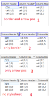
It seems to be connected to whether the section pseudo-element has a box set, and whether the up-arrow pseudo-element has a position set. The attached image and code samples link the stylesheet settings to the header layouts.
To summarise the behaviour:
- section has border and arrow has position: sort indicator space is always reserved
- section has border, no arrow position: sort indicator space is never reserved, so indicator overlaps text, maybe a separate bug
- arrow has position, no section border specified: some space is always reserved, but I'm not sure if this is for the sort indicator as it appears smaller than in the first case
- no stylesheet, use fusion style: behaves as I would expect, space only reserved in the sorted section.
On our Qt fork, a simple check on the style option in `QStyleSheetStyle::drawControl` seems to fix it, though it may also depend on the specific stylesheet our app uses.
https://github.com/seequent/qtbase/commit/5fa87151096f52ae8596def970a5644f91fcc994
| For Gerrit Dashboard: QTBUG-115486 | ||||||
|---|---|---|---|---|---|---|
| # | Subject | Branch | Project | Status | CR | V |
| 506680,3 | ItemViews/css: Honor size for sort indicator only when there is one | dev | qt/qtbase | Status: MERGED | +2 | 0 |
| 507104,2 | ItemViews/css: Honor size for sort indicator only when there is one | 6.6 | qt/qtbase | Status: MERGED | +2 | 0 |
| 507110,2 | ItemViews/css: Honor size for sort indicator only when there is one | 6.5 | qt/qtbase | Status: MERGED | +2 | 0 |
