-
Suggestion
-
Resolution: Fixed
-
P2: Important
-
None
-
None
-
8
-
375e0e2c7 (dev), c3f69a2da (6.7), 56654d791 (6.6), 2e34eac8d (dev), 062d09104 (6.10), 8d7eddbc5 (6.9), 58b62ad42 (tqtc/lts-6.8)
-
Foundations Sprint 96, Foundations Sprint 97, Foundations Sprint 98
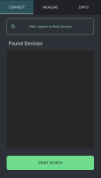
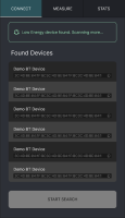
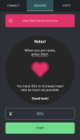
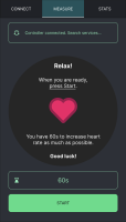
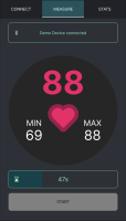
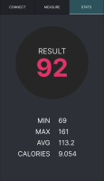
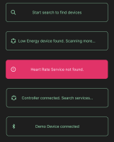
Layout rearrangement and a few UI / UX / Interaction design recommendations to improve the example overall.
- Top menu underline and colour of the buttons
-> to make clear which tab is selected - Rearrangement of Found Devices section with text size and padding change for bluetooth address
-> to improve reading - Found Devices extra suggestion: a small copy to clipboard icon for the bluetooth address
-> to support developers on checking and testing - Notification Message box repositioning, resizing, colour change, style
-> to separate from top menu and improve reading contrast - Notification Messages order including an initial message
-> to make the steps clear - Start button colour change
-> to emphasise hierarchy and button function - Layout of instruction text on "Measure" tab
-> to make text clear in order of steps and improve layout visual and reading experience - Layout of measure panel and time count box
-> to improve layout visual and reading experience - Layout of "Stats" page
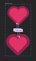
-> to improve layout visual and reading experience - Measure panel extra suggestion: heart beat animation if possible to implement

-> run Figma prototype and click on Start at the "Measure" page to see animation
| For Gerrit Dashboard: QTBUG-118905 | ||||||
|---|---|---|---|---|---|---|
| # | Subject | Branch | Project | Status | CR | V |
| 519451,12 | Update BTLE Heartrate Game example UI | dev | qt/qtconnectivity | Status: MERGED | +2 | 0 |
| 527244,2 | Update BTLE Heartrate Game example UI | 6.7 | qt/qtconnectivity | Status: MERGED | +2 | 0 |
| 527299,2 | Update BTLE Heartrate Game example UI | 6.6 | qt/qtconnectivity | Status: MERGED | +2 | 0 |
| 675318,10 | Update the QtBluetooth/heartrate_game example | dev | pyside/pyside-setup | Status: MERGED | +2 | 0 |
| 676018,2 | Update the QtBluetooth/heartrate_game example | 6.10 | pyside/pyside-setup | Status: MERGED | +2 | 0 |
| 676041,2 | Update the QtBluetooth/heartrate_game example | 6.9 | pyside/pyside-setup | Status: MERGED | +2 | 0 |
| 676061,2 | Update the QtBluetooth/heartrate_game example | tqtc/lts-6.8 | pyside/tqtc-pyside-setup | Status: MERGED | +2 | 0 |
