-
Bug
-
Resolution: Fixed
-
 P2: Important
-
6.7.0 Beta3
-
None
-
Windows
-
de3d5dd73 (dev), 90963387e (6.7), 1d244eb91 (6.6), 875f8a795 (tqtc/lts-6.5)
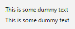
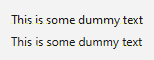
By default, with DirectWrite as the fontengine, when not using high-DPI scaling, fonts will render with CLEARTYPE_GDI_CLASSIC, which can make them look squashed (e.g. no space between m and e):
| fontenegine | DirectWrite | GDI |
|---|---|---|
| top: default hinting bottom: vertical hinting |
 |
 |
(code in hinting-1.cpp)
I tested this in a larger application and this does make quite the difference (also having to manually set the hinting doesn't seem like a good solution, especially since DirectWrite is the default). If you enable high-DPI scaling, the default hinting will look like with GDI again.
Removing the check for high-DPI scaling in hintingPreferenceToRenderingMode (qwindowsfontenginedirectwrite.cpp) would resolve this issue.
- relates to
-
-

- Closed
-
| For Gerrit Dashboard: QTBUG-122139 | ||||||
|---|---|---|---|---|---|---|
| # | Subject | Branch | Project | Status | CR | V |
| 539732,3 | Fix kerning errors when using DirectWrite backend | dev | qt/qtbase | Status: MERGED | +2 | 0 |
| 540449,2 | Fix kerning errors when using DirectWrite backend | 6.7 | qt/qtbase | Status: MERGED | +2 | 0 |
| 540612,2 | Fix kerning errors when using DirectWrite backend | 6.6 | qt/qtbase | Status: MERGED | +2 | 0 |
| 540706,2 | Fix kerning errors when using DirectWrite backend | tqtc/lts-6.5 | qt/tqtc-qtbase | Status: MERGED | +2 | 0 |