-
Bug
-
Resolution: Won't Do
-
 Not Evaluated
-
None
-
6.8.0
-
None
-
Windows 11 23H2
The new Qt Windows 11 does not look very native. Screenshot shows Qt 6.8.0 vs Notepad.
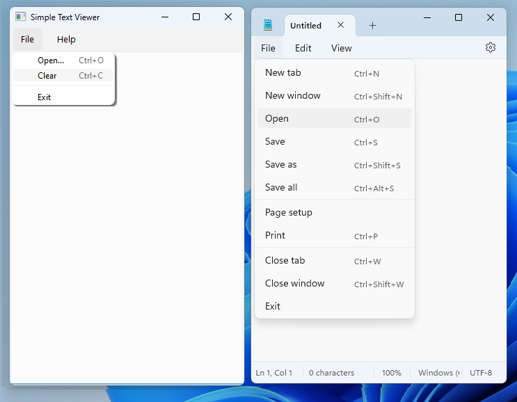
Here are differences I can spot with 200% display scaling:
1) Qt menu drop-shadow is too dark and pixelated at the borders. Notepad much more soft, and larger.
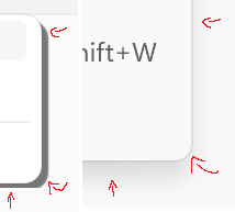
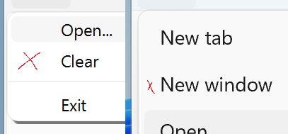
2) Qt menu items are too close to each other. Notepad much more spaced out.

3) Qt menu font is wrong. On the popup as well as buttons. Too small and wrong font family.

4) Every Qt menu entry has a gap on the left. Notepad not really.
5) Qt menu popup border is not clearly defined, although a bit hard to tell with the shadow. Notepad has a clear defined gray 1px border. See upper left round corner.

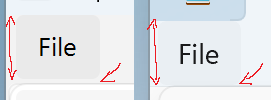
6) The "File" button seems to be too high. Also there is a slight margin below File highlight
7) Menu title bar has wrong color, gray instead of blue-toned. Both background and highlight colors.

8) Menu itself also has wrong background and title color.
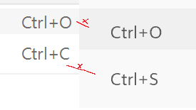
9) QMenu does not match the animation.
- QMenu shows no animation
- Notepad shows animation opening and closing menu, as well as switching from File to Edit.