Details
-
Suggestion
-
Resolution: Unresolved
-
 P3: Somewhat important
-
None
-
6.8.2
Description
One can use the snippet here:
https://doc.qt.io/qt-6/qtgraphs-migration-guide-2d.html#migrating-line-series
to see how axes look different for QtCharts and QtGraphs.
The default look of QtCharts is that ticks on axes pinpoint each data point:
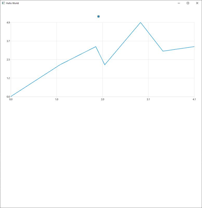
Although the intervals are somewhat "inconsistent", the ticks at, e.g. x = 3.1, x = 4.1, y = 1.2, etc.., exactly matches each data point.
And when it comes to QtGraphs, it has nice consistent intervals between ticks, but those ticks do not care about actual data point (it's min + predefined interval, e.g. 0.5, regardless):
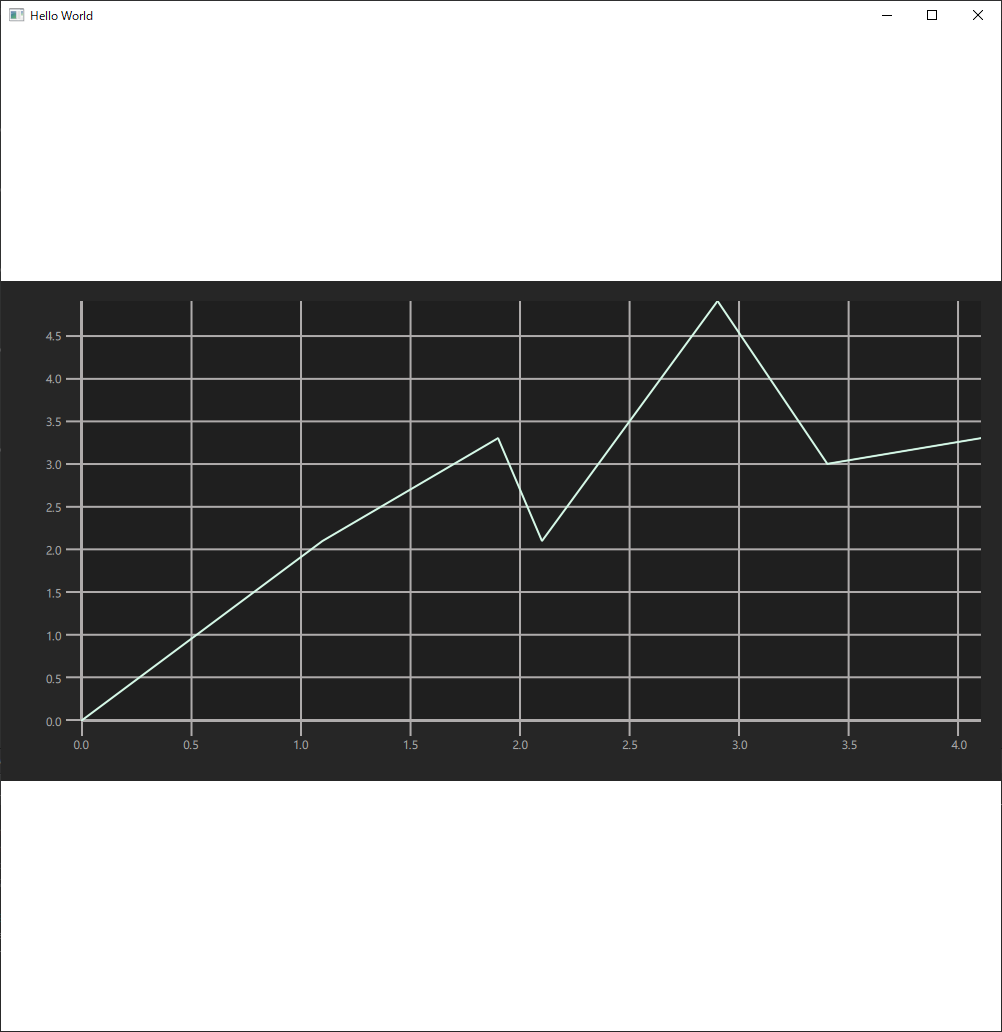
Admittedly, what QtGraphs shows may look more scientific and reasonable, there are people who prefer the old look. So maybe add a "switch"?

