-
Bug
-
Resolution: Fixed
-
 P1: Critical
-
6.7.3
-
None
-
Windows
-
98eabf10b (tqtc/lts-6.5), 081062ea5 (dev), dba6b5c48 (6.10), 4fa1e4889 (6.9), 9ad671778 (tqtc/lts-6.8), 61129f1a7 (tqtc/lts-6.5), 5868f8a1d (dev), b787756d4 (6.10), 3d7e1c146 (6.9), f38296ac3 (tqtc/lts-6.8), 90eaea2f0 (tqtc/lts-6.5)
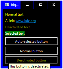
On Windows 10, Qt apps use wrong colors for links, disabled text and tool tips if high-contrast mode is activated.
This is how a small test app (highcontrasttestapp.zip) looks like on Windows 10 (with windowsvista style) if high-contrast color scheme Contrast No. 1 is active:

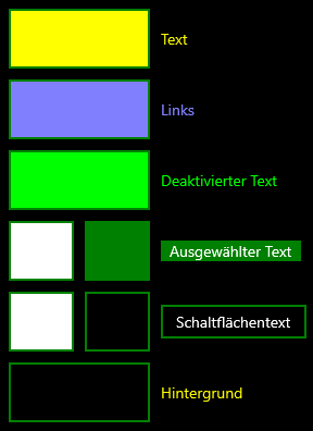
These are the colors defined by Contrast No. 1 color scheme that should be used:
In particular, the text color for deactivated text has very poor contrast. And the colors used for the tool tips are the default colors for light color schemes. Windows itself uses the button colors (white text on black with white border) for tool tips.