-
Bug
-
Resolution: Fixed
-
 P2: Important
-
6.9
-
Windows
-
f26fd50d0 (dev), ccefe0279 (6.10), d48185433 (dev), 8455467c4 (6.10), 9fe2ea401 (6.9), 51403ef8b (tqtc/lts-6.8), 95d784cca (dev), b25366d75 (dev), 81a463499 (6.10), b41945c8e (6.10)
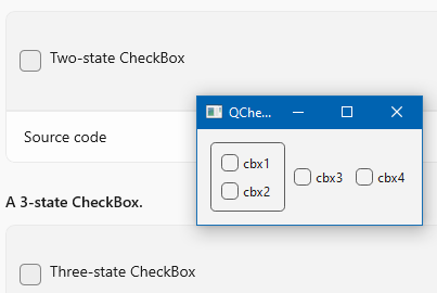
I compared the checkboxes/radiobuttons style from windows11 style with the 'official' Figma/MS style examples (Figma WinUI kit and WinUI 3 Gallery) and found some differences which I'm not sure if they are indented or were simply overseen:
Differences in the WinUI 3 style
- a checked button has no border
- when the mouse is pressed on a radiobutton, the inner circle has the same size as without mouse focus
- the accent color is lighter when hovered
- the checkmark is black instead white
- the intermediate checkmark is shorter
- the buttons are greater (18x18)
maybe other misc stuff I forgot to mention.
I've provided a wip patch to fix some of these issues but the main question remains - do I look at the correct template? Or do you use some customized winui3 style which I'm not aware of?
- is duplicated by
-
-

- Closed
-
- resulted in
-
-

- Closed
-