-
 Epic
Epic
-
Resolution: Unresolved
-
 P2: Important
-
None
-
None
-
None
-
Toy Customizer Example
Styling
There different ways to style the application:
- Make a custom style (ToyStyle) to implement the controls
- Customize only the controls which are used in the example, like:
- QuteLabel
- QuteButton
Settings
Some information which are needed to be used in the next time running can be stored in the application settings.
View
The front-end implementations should be done in different views and components. The navigation and transition logic is:
Main→ToyGalleryPage→ToyConfirmPage→ToyCustomizePage [→PreviewPage]
Main
The main page is the page that the application window exists in.
Should include:
- The main layout of the application.
- Showcase view
- An option to start choosing the toy (move to ToyGalleryPage)
ToyShowcaseView
A view of introduction of toys which is visible as a welcome view when the application just started to run.
ToyGalleryPage
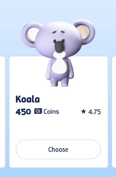
- This view shows the list of the toys.
- Each element includes the toy image (2D/3D) and a brief information, like the user rate and the cost.
- The user can select one. (moves to ToyConfirmPage)
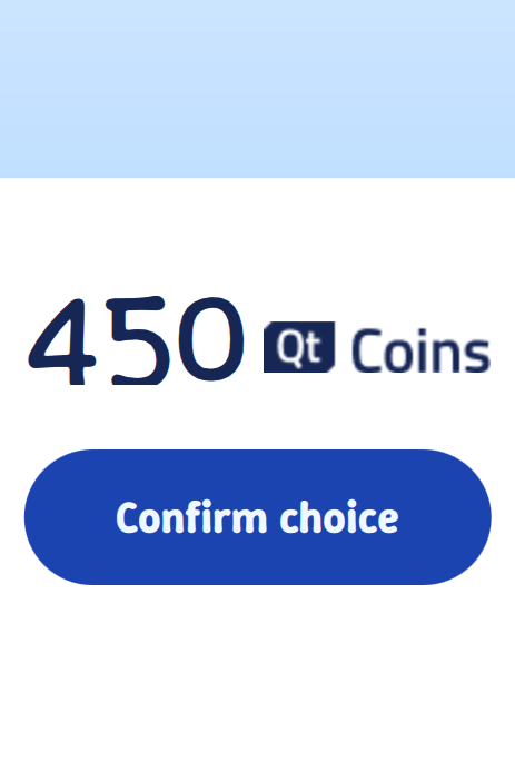
ToyConfirmPage
- It shows the details about the chosen toy.
- The user can cancel the choice (moves back to the ToyGalleryPage)
- The user can confirm the choice (moves to ToyCustomizePage)
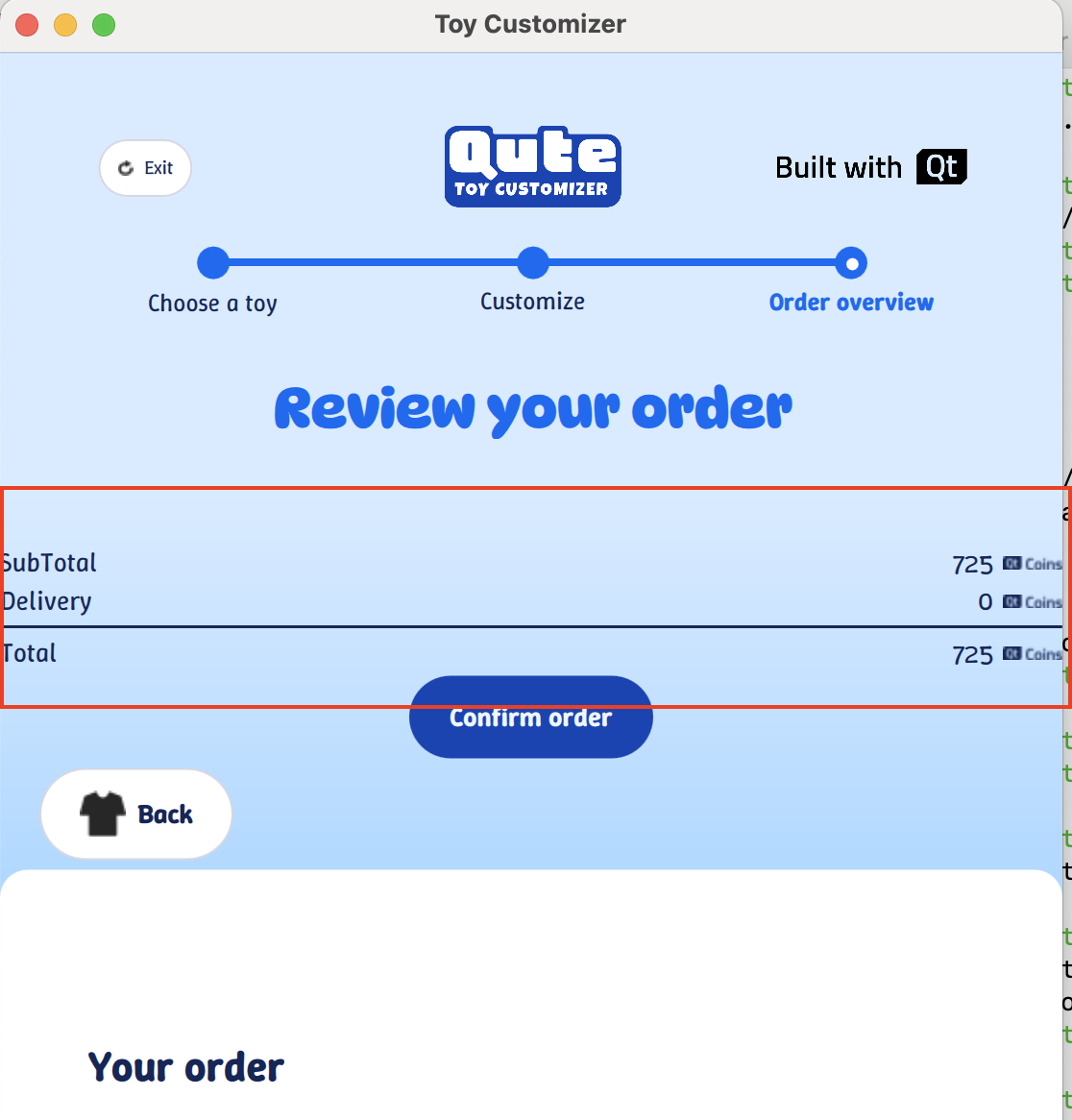
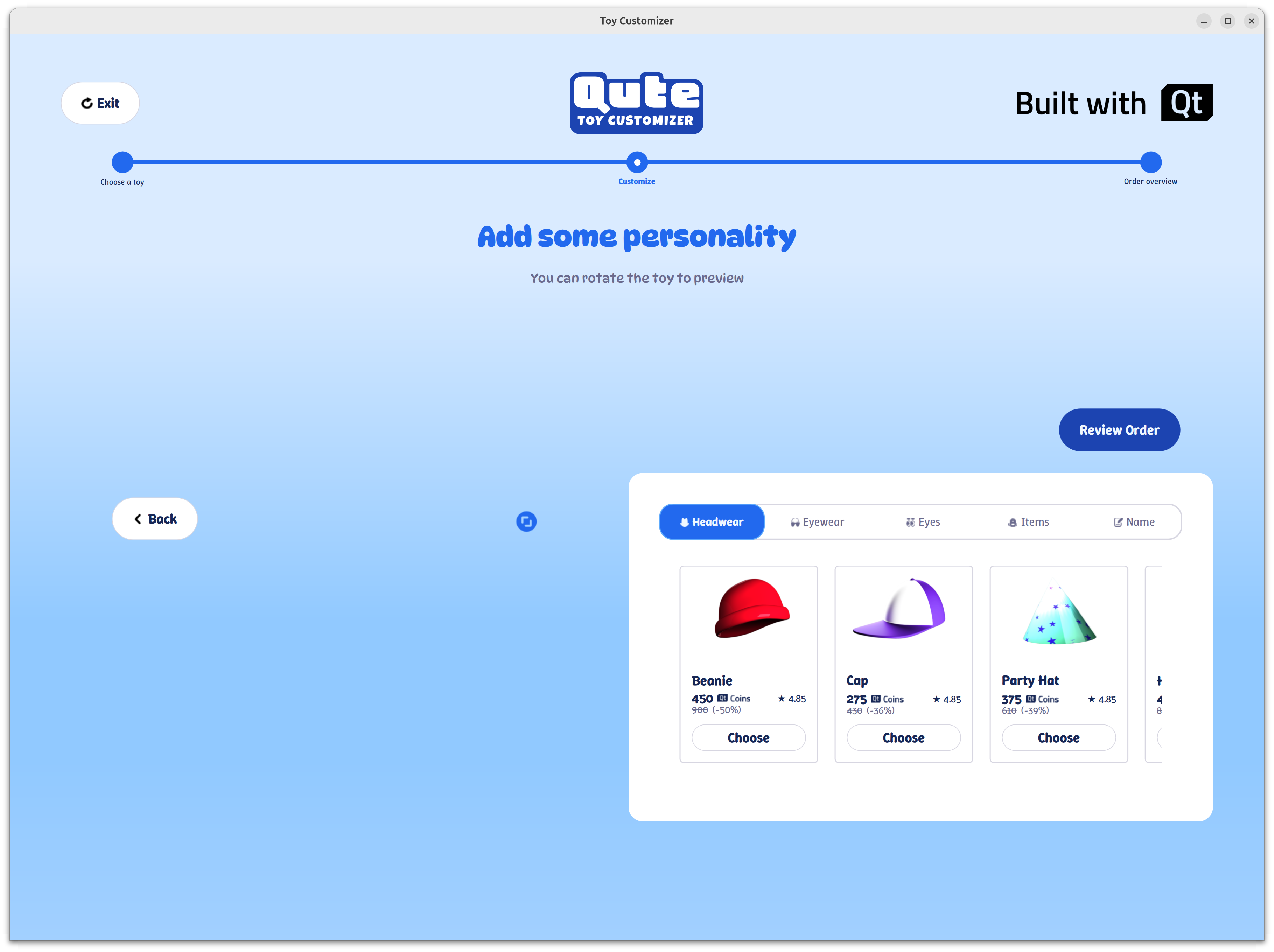
ToyCustomizePage
- Includes two views:
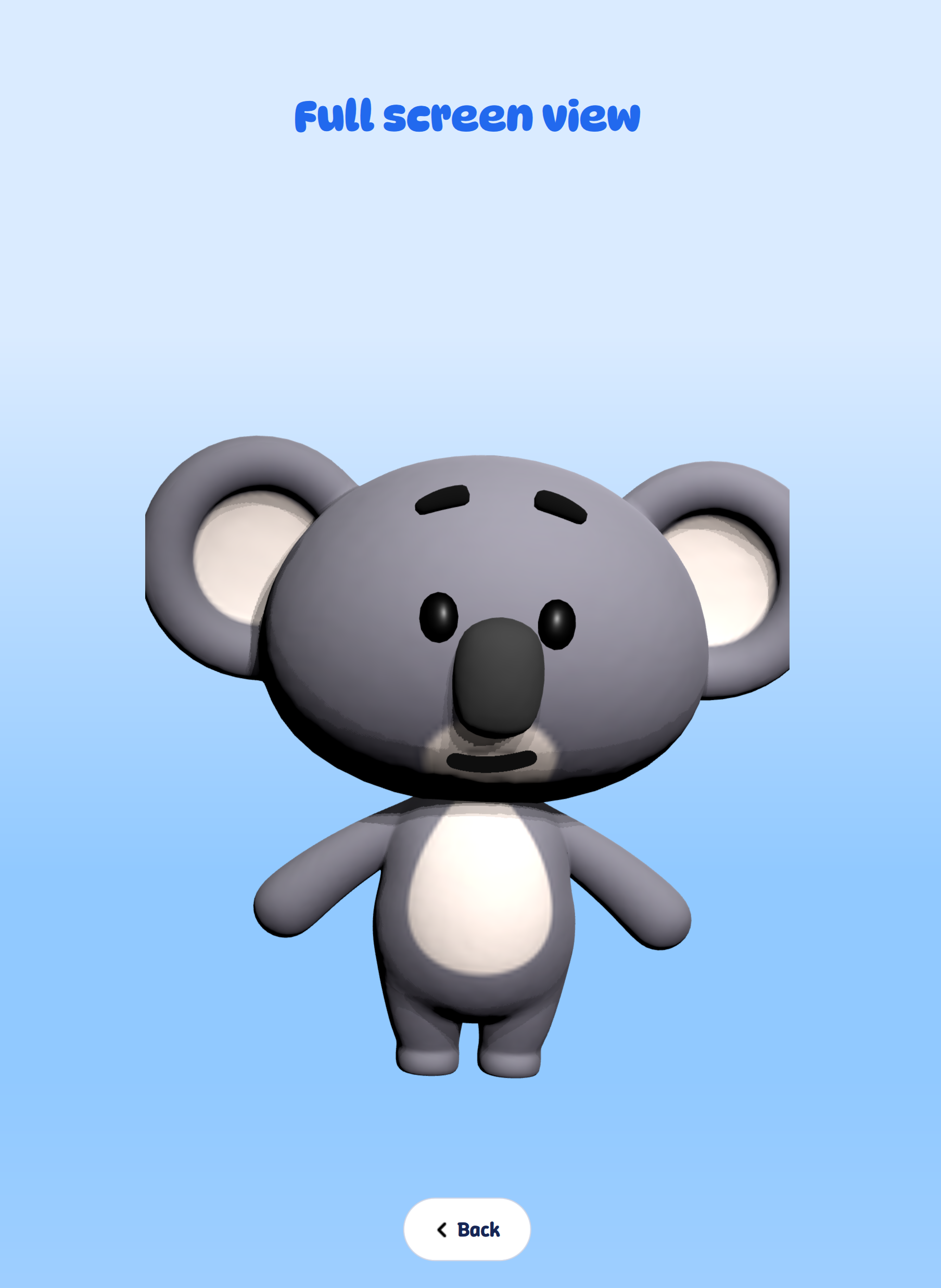
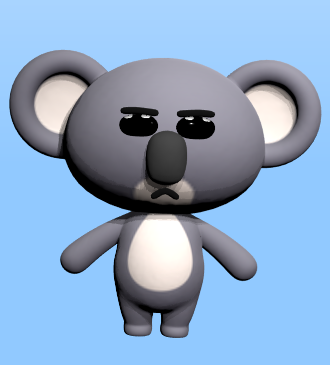
- ToyPreview: This view shows a preview of the chosen toy with the selected accessories
- ToyAccessoryView: This view shows the lists of items in different categories.
- Choosing an accessory will update the ToyPreview view
- The user can interact with the preview view to see the customized toy from different angles
- The preview view can be full size in the page and the user can resize it back.
- A button to confirm the order
Model
The data and resources for the view should be stored in a model (QAbstractItemModel).
- Toy model: Each toy includes:
- A 2D image
- Some information, e.g. cost, user rate, etc.
- A 3D object model
- Accessory model: The accessory model is list of categories that each category includes a list of items. Each item has:
- An image
- Some information, e.g. cost, user rate, etc.
- A 3D object model
Responsive UI
The window(s), pages, and views should be responsive that means they should:
- respect the orientation (landscape and portrait)
- respect the screen sizes and the breakpoints (small, medium, large, XXL)
- support touch events
- have a good performance and work smoothly
Accessibility
The application should respect to:
- Dark/Light color-scheme: The application could switch between dark and light modes.
- High-contrast: By enabling the high-contrast in the system settings the custom style should get updated to be high-contrast enough; e.g. the borders and some of the colors.
- Font size: By changing the font size in the system settings the texts in the application should get increased or decreased depending to the settings changes.
- Screen reader: When the screen reader is enabled in the system settings, the components (which are intended to be accessible) should be reported to the screen reader.
Documentation
Add a documentation for the Toy Customizer example to introduce the example and give some information about the features and the technologies which are used in the example.
| For Gerrit Dashboard: QTBUG-138227 | ||||||
|---|---|---|---|---|---|---|
| # | Subject | Branch | Project | Status | CR | V |
| 683846,10 | ToyCustomizer initial commit: download assets | dev | qt/qtdoc | Status: NEW | 0 | 0 |
| 683847,15 | ToyCustomizer: Add Intro/MainPage with animated 3D view | dev | qt/qtdoc | Status: NEW | 0 | 0 |
| 683848,17 | ToyCustomizer: Add Gallery page with toy selection grid | dev | qt/qtdoc | Status: NEW | 0 | 0 |
| 683849,20 | ToyCustomizer: Add Confirm page with detailed toy view | dev | qt/qtdoc | Status: NEW | 0 | 0 |
| 683850,24 | ToyCustomizer: Add Customize page for toy personalization | dev | qt/qtdoc | Status: NEW | 0 | 0 |
| 683937,25 | ToyCustomizer: Add toy custom items with 3D integration | dev | qt/qtdoc | Status: NEW | 0 | 0 |
| 683938,27 | ToyCustomizer: Add Overview page for order summary | dev | qt/qtdoc | Status: NEW | 0 | 0 |
| 683939,27 | ToyCustomizer: Add Final page for order confirmation and restart | dev | qt/qtdoc | Status: NEW | 0 | 0 |