-
Bug
-
Resolution: Duplicate
-
 Not Evaluated
-
None
-
6.9.0, 6.10.0 Beta2
-
None
-
Windows 11 24H2
QT 6.9.0
-
Windows
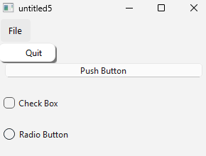
The shadow behind the menu bar looks bad and does not follow system UIs or WinUI3 guidelines. The background of the menu is white, which does not match any system UIs or WinUI3 guidelines.

Code:
#include <QApplication>
#include <QPushButton>
#include <QCheckBox>
#include <QRadioButton>
#include <QMainWindow>
#include <QMenuBar>
#include <QVBoxLayout>

int main(int argc, char *argv[])
{
    QApplication a(argc, argv);
    QMainWindow window;
    window.menuBar()->addMenu("&File")->addAction("&Quit")->setEnabled(true);

    QWidget *centralWidget = new QWidget;
    window.setCentralWidget(centralWidget);

    QVBoxLayout *layout = new QVBoxLayout(centralWidget);

    QPushButton *button = new QPushButton("Push Button");
    QCheckBox *checkBox = new QCheckBox("Check Box");
    QRadioButton *radioButton = new QRadioButton("Radio Button");

    layout->addWidget(button);
    layout->addWidget(checkBox);
    layout->addWidget(radioButton);

    window.resize(300, 200);

    window.show();
    return QApplication::exec();
}
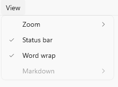
Example of how Notepad UI looks. It seems not to have a shadow but instead opts for a thin border.
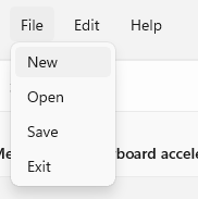
Example of how WinUI 3 Gallery menu looks. It has a shadow in addition to a border.

If we open the Figma UI kit we can see that:
- there should be a 1px stroke rgba(0,0,0,0.0578)
- there should be a drop shadow with offset X=0, Y=8, Blur=16, Color=rgba(0,0,0,0.14)
- it uses an acrylic background with a #ffffff background. The acrylic background on figma is defined as a noise texture with 2% opacity, overlayed with the color rgba(252,252,252,0.85). However in the case of the WinUI gallery app the fill seems to be just a static #F9F9F9 based on a screenshot.
The current shadow is much darker, with less blur and has a high X offset. Deleting the shadow and following what Notepad does would be a great improvement design wise than what is done currently.
- duplicates
-
-

- Open
-