-
Bug
-
Resolution: Unresolved
-
 P2: Important
-
None
-
6.9.2
-
Windows
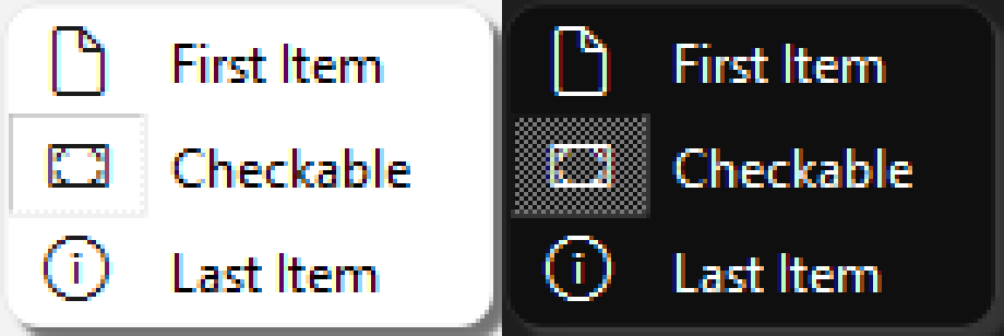
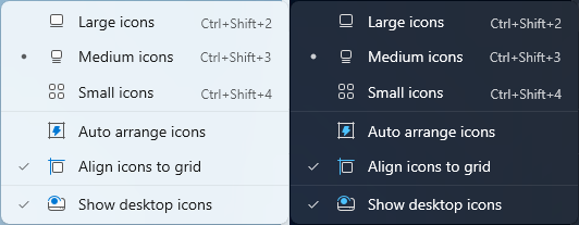
Checked menu items, especially those with icons, look odd with the windows11 style. I suspect this part of the drawing code was borrowed from the old windows style and never updated for windows11:
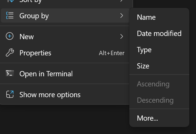
For comparison, this is how a Windows 11 menu looks (right click on Desktop -> View submenu):

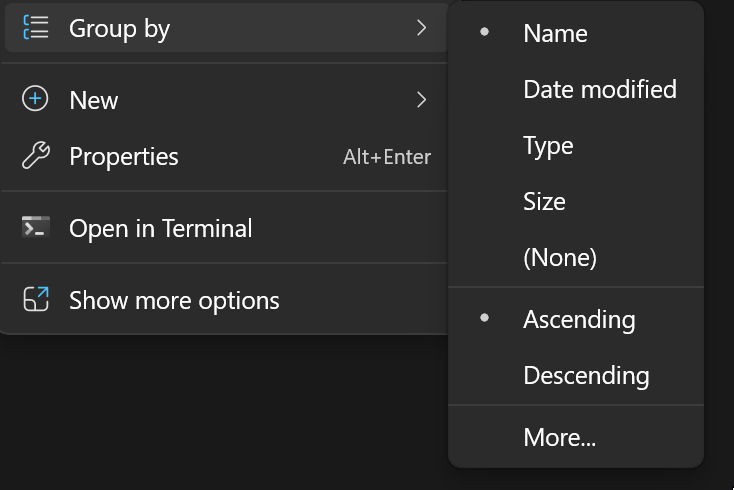
I don't know how closely you intend to match Microsoft's styling but even if it were going for something more like this, I think it wouldn't look as strange:

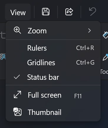
That's from the bottom right of Explorer on the status bar which I believe isn't using updated WinUI styling, but if that is easier to implement, at least it wouldn't look quite so out of place. Or this which is a mockup provided by one of my app's users:


| For Gerrit Dashboard: QTBUG-139693 | ||||||
|---|---|---|---|---|---|---|
| # | Subject | Branch | Project | Status | CR | V |
| 673901,9 | QWindows11Style: Fix menu item checkmark/icon painting | dev | qt/qtbase | Status: NEW | 0 | 0 |