-
Bug
-
Resolution: Unresolved
-
 P2: Important
-
None
-
6.9.3, 6.10.0
-
Windows
This is a re-opening of this bug report: QTBUG-133118. And this bug is a subset of several Windows 11 QTreeView style issues that have been addressed here: QTBUG-139627
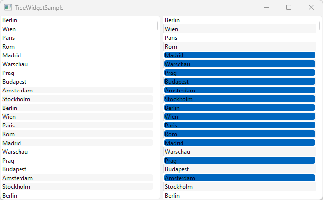
In version 6.10.0, selections in QTreeViews are still difficult to read in Windows 11. There is also a big difference in the display depending on whether alternating row colors are turned on or off.
The attached minimal example shows both visualizations at the same time. There is an extended selection on both sides. The contrast between the text, the selected cells, and the cell background is difficult to read in both cases. Is that really the intended final solution?

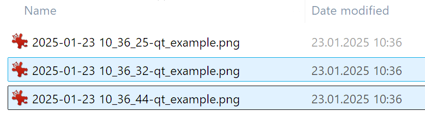
For comparison: The (default) native selection visualization of the Windows 11 Explorer represents a kind of gold standard for me. Both the selection and the text of the selected lines are clearly legible:

- is duplicated by
-
-
- Closed
-
- relates to
-
-

- Open
-
-
-

- Closed
-