Uploaded image for project: 'Qt'
  1. Qt
  2. QTBUG-141601

ColorPalette example looks bad in dark mode

XMLWordPrintable

    • Icon: Bug Bug
    • Resolution: Unresolved
    • Icon: P2: Important P2: Important
    • None
    • 6.11
    • None

      The colorpalette example looks terrible in dark mode, see here:

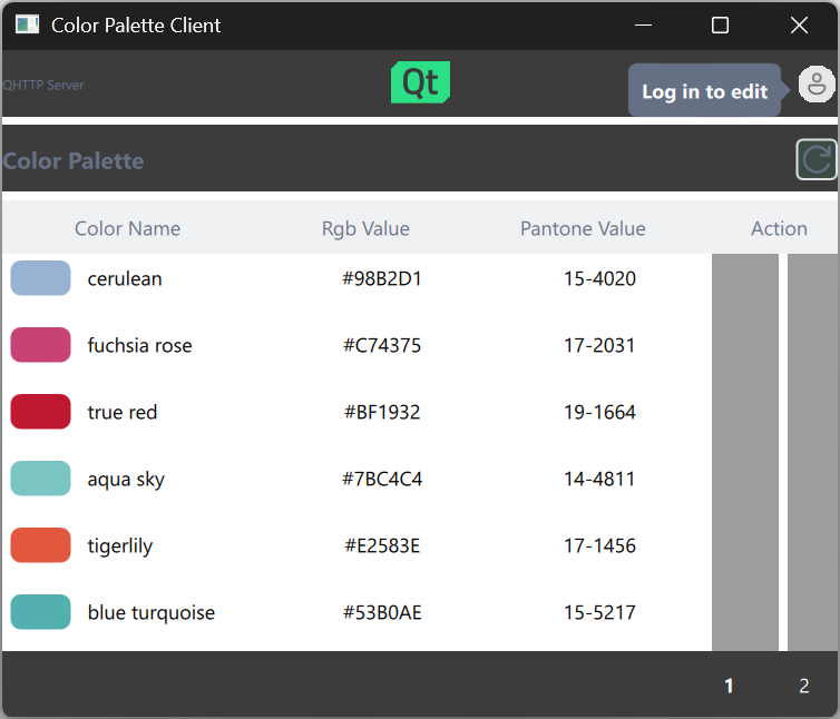
      The current UI was created with this task: https://bugreports.qt.io/browse/QTBUG-115085 based on the figma design given there.

      The colorpalette example will be reused to showcase QtBridges and OpenAPI. So it would be important to give a good first impression.

      We should do two things:

      • Make sure that it looks nice in dark mode
      • Revise the design and see if there are some low hanging fruits to improve it.

        No reviews matched the request. Check your Options in the drop-down menu of this sections header.

            docteam Qt Documentation Team
            matthias_rauter Matthias Rauter
            Votes:
            0 Vote for this issue
            Watchers:
            1 Start watching this issue

              Created:
              Updated:

                There are no open Gerrit changes