-
Suggestion
-
Resolution: Done
-
P5: Not important
-
None
-
5.3.1
-
None
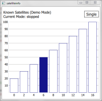
SatelliteInfo example http://qt-project.org/doc/qt-5/qtpositioning-satelliteinfo-example.html could could be a bit polished:
Example has different states (stopped, single and running) which are a bit unnecessary from the application use perspective (i.e. why would user wan't to stop the updates?). Removing these would simplify the code. This would also allow removing the button (startStop) from the UI.
Last Error is confusing. What does "Last Error: 1" mean? Should it be just removed?
Signal Strength legend implementation is 91 lines of code which could be replaced with Gradient (4 lines of code) and the end result would be better looking. Also it is questionable how valid the the whole legend as in signal strength is not the only factor to determine if the satellite data is "good = green" or "bad = red". Also it seems that in normal phones values are under 40 leaving a lot of empty space in the graph. --> Legend should be removed as a whole? Scale of the bars should be adjusted based on the actual signal strengths?
Elevation and Azimuth properties are available in the satellite model which would make "satellite map" implementation quite easy? See e.g. http://www.gpsreview.net/satellite-info-screen/
Visual modification suggestions:
- Rounded rectangle should be removed
- Different colors in satellite bars are not intuitive. What does it mean if the bar is red/blue? Maybe having those satellites that that are not used in calculation with very light blue.
- Explanation about the signal strength should be added?
- Meaning of the numbers in satellite bars is not intuitive. Explanation should be added.
- In situation when there's a lot of satellites the numbers are drawn on top of each other.
- relates to
-
QTBUG-41253 Issues Related to Qt Examples (meta bug)
-
- Closed
-
