-
Suggestion
-
Resolution: Done
-
P3: Somewhat important
-
5.11.0
-
None
-
b943bbf91162ba8aad4a6c3b0c7ca2e944a26105 (qt/qtquickcontrols2/5.12)
User feedback has brought up that the current UX of the ComboBox in Fusion style is quite irritating.
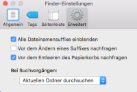
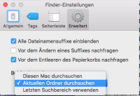
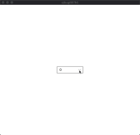
Please have a look at the attached screenshots.
Default Style
The opened combobox highlights (bold) the currentIndex (10). This is ok.
Fusion Style
The highlighted index is easily mistaken to be the currentIndex because there is no highlight of the currentIndex. It looks like "11" is currently selected.
Both visualizations are not ideal but the current Fusion implementation is really confusing.
How do other popular UIs implement this?
macOS: When openig a combobox, the popup is positioned so that the currently selected entry is always right under the mouse cursor and additionally checked. IMHO this is a very nice solution
Windows: The highlighIndex is set to the currentIndex until another item is selected by keyboard or mouseover. The popup is below or above the combobox so that the currentIndex value is always displayed.


