-
Bug
-
Resolution: Unresolved
-
 P2: Important
-
None
-
5.4.2, 5.9.2, 5.11.1
-
None
-
windows 8
-
Windows
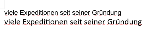
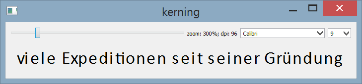
We noticed that some fonts have incorrect kerning for relatively small point sizes: for instance Arial (size 7) and Calibri (size 9), see the attached arial_07.png and calibri_09.png. The most prominent example is that the letter "i" in "viele" stays closer to one of its neighbours. Compare these screenshots with how the same fonts look in LibreOffice Writer, see arial_07_and_calibri_09_in_libreoffice_writer.png.
Note that the issue is sensitive to the screen dpi. It is recommended to set the "Change the size of all items" factor in Control Panel -> Appearance and Personalization -> Display to the smallest value (on windows 10 it's "Change the size of text, apps and other items" in Display settings). The problem is not noticeable with large dpi or/and for large point sizes.
I tested it on windows 8, but I was told that it is visible on other windows versions too. I don't know if this issue is related to QTBUG-49646 because I didn't test it on linux, but I haven't noticed this problem on macOS.
I attached the sample code (main.cpp) for reproduction. The first 2 screenshots were made using this code.