-
Bug
-
Resolution: Unresolved
-
P2: Important
-
None
-
5.12.1
-
None
-
-
8961493b4036af018842820238c4eda0c0717e64
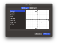
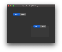
If you build and run the attached test application in Dark mode, everything looks fine when the application is active (test-active), except for the unselected tab in the QTabWidget object, which is semi-transparent while I would expect it to be opaque. Still, this is roughly in agreement with Apple's Grapher application (grapher-active).
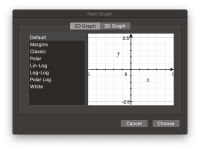
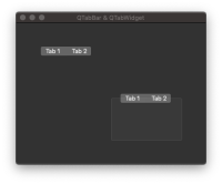
Now, if the test application is inactive then you can't distinguish the selected tabs from the unselected ones at all (test-inactive). Also, as before, the tabs are still semi-transparent in the QTabWidget object. In Apple's Grapher application (grapher-inactive), we can see that the label of selected tab gets darker and its background lighter, which is also what I would expect using QTabBar and QTabWidget.
- duplicates
-
QTBUG-71741 [macOS] QTabWidget is incorrectly drawn in 5.12 in Mojave
-
- Closed
-
- relates to
-
QTBUG-73788 Scrollbars don't have the right colour in Dark mode on macOS Mojave
-
- Closed
-


