-
Bug
-
Resolution: Unresolved
-
 P2: Important
-
None
-
5.12.0, 5.13.0, 5.13.1
-
None
-
macOS 10.14.6
-
macOS
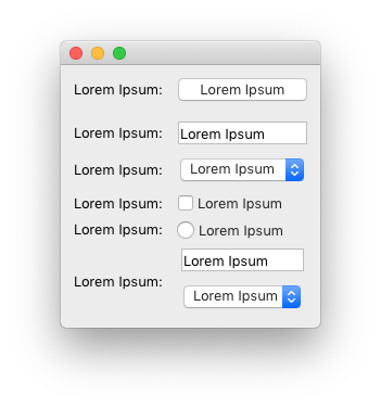
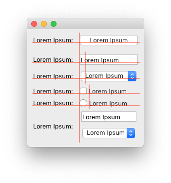
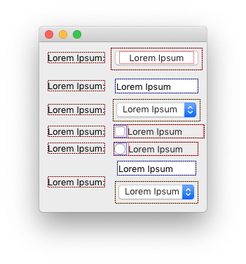
When using the default macOS style (-style macintosh), there is a terrible misalignment between various UI widgets. The attached example app and creenshots demonstrate this.
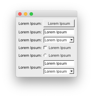
Mac1.png is how it looks on macOS. Mac2.png is the same but with hinting lines showing various places of misalignment. Win.png is how it looks with the old good Windows style (-style windows on the command line).
I see the following problems (all is placed using QGridLayout):
- QComboBox (row 3, column 2) has extra margins compared to QPushButton and QLineEdit above and to QCheckBox below.
- QRadioButton (row 5, column 2) is misaligned by 1px to the left compared to QPushButton, QLineEdit and QCheckBox.
- A group of QLineEdit and QComboBox at row 6 combined using QVBoxLayout has extra margins.
- Text of QLineEdit (row 2) and QComboBox (row 3) does not align vertically.
- Text of QCheckBox (row 4) and QRadioButton (row 5) does not align vertically.
- Text of QLabel in column 1 and the widget in column 2 is misaligned horizontally by 1 px at rows 2 (QLineEdit), 3 (QComboBox) and 5 (QRadioButton).
- Spacing between rows is not equal (it.s bigger between row 1 and 2, smaller between row 2 and 3 and even more smaller between further rows).
All those mentioned problems break too many UI/UX guidelines. This is not how applications should look like. Compare the appearance to Win.png (where everything is aligned properly) to see the difference.