-
Suggestion
-
Resolution: Fixed
-
P2: Important
-
None
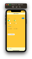
Add a new "native" style to Qt Quick Controls for iOS. The style will be pixmap based (as opposed to the native macOS and Windows style), which means that we accept that it will deviate a bit from UIKit's own controls, but still look at home on iOS. This is basically the same approach as done with the Cupertino style in Flutter The upshot is that the style will be easier to implement and maintain, and not be subject to annual visual regressions as a result of changes to iOS. The worst-case is that the style can end up looking outdated over time if not maintained, but that is easier to accept, and also easier to fix.
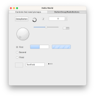
Controls that need styling
| Quick Control | UIKit Control | Notes | Progress |
|---|---|---|---|
| DelayButton | A variant of Button with a progress indicator. | Done | |
| BusyIndicator | UIActivityIndicatorView | A Spinning wheel | Done |
| CheckBox | Technically the same as Switch, which you would probably use in a native iOS app instead |
Done | |
| SpinBox | UIStepper | Done | |
| Dial | Technically the same as slider | Done | |
| Slider | UISlider | Draws handle and groove separate. Groove fills up on left side as you drag. Needs coding for animation |
Done |
| Switch | UISwitch | Done | |
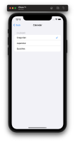
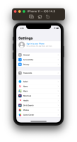
| RadioButton | There is no RadioButton control in UIKit. Instead they use a list with checkmarks (ref the iOS Settings app - see attachment UIKit_back_and_checkmark). But let's create a RadioButton anyway, for cross-platform support. Then we say that a Button that is checkable can be rendered as a list item with a checkmark to the right. And when added to a ButtonGroup, you should get the same effect as shown in the attachment. |
Done | |
| ProgressBar | UIProgressView | Just a (rounded) rectangle. It can use the Slider's background. But indeterminate should be an animation (which is missing in UIKit) | Done |
| TextField | UITextField | Just a thin frame, can probably just use Frame directly | Done |
| PageIndicator | UIPageControl | Done | |
| ScrollIndicator | Just a thin line (with rounded cap) | Done | |
| ItemDelegate | Background with separator line | Done | |
| Menu | UIMenu | Background | Done |
| Menu Item | Background with separator line | Done | |
| MenuSeparator | Thick separator line | Done | |
| Drawer | Done | ||
| Popup | Background | Done | |
| Dialog | Done | ||
| DialogButtonBox | Done | ||
| ToolTip | Done | ||
| SelectionRectangle | Done |
- therefore skipped|-|
ToolTipQPA— Tumbler UIPickerView QPA - Additional pixmaps / icons
Pixmap Usage Notes Checkmark StackView, Checkable Button See attachement UIKit_back_and_checkmark Back IconStackViewSee attachement UIKit_back_and_checkmarkDrill-down / Expand Icon TreeView (TreeViewDelegate) See attachement UIKit_tree_expand Horizontal separator Views (ItemDelegate) Just a horizontal line Vertical separator ToolSeparator, DialogButtonBox separator Vertical line Handle for Selection rectangle SelectionRectangle Controls that can be coded exclusively in QML
Quick Control UIKit Control Notes Progress Label UILabel Done Button UIButton Just a Label Done ComboBox UIButton (Pull Down configuration) Just a Label + popup. Reuse Menu pixmaps Done Frame Missing in UIKit. But should have the same shape as TextInput. Done GroupBox Just a Frame + Label Done RangeSlider Slider with two handles. Reuse Slider pixmaps Done ScrollBar Same as ScrollIndicator Done StackView Uses Back Icon +animationsDone SplitView Thin separator line with increased hit area Done TreeViewDelegate Uses Expand Icon Done CheckDelegate Uses checkmark/checkbox icon Done RadioDelegate Uses checkmark icon Done SwitchDelegate Uses Switch Done SwipeDelegate Done MenuBarItem Missing in UIKit. Should be same as UIBarButtonItem Just a Label (with expand icon)Done TextArea UITextView Done TabBar UITabBar Rectangle with separator line for now.
Later we can implement a translucency effect which blurs the background similar to the native one.Done MenuBar - Same as Tabbar Done ToolBar UIToolBar Same as Tabbar Done TabButton UITabBarItem Done ToolButton UIBarButtonItem Done
- All pixmaps will need to be a NinePatchImage
- All pixmaps must have three sizes: 1x, 2x, and 3x . E.g switch-background.9.png, switch-background@2x.9.png
 , switch-background@3x.9.png
- All pixmaps must have a dark and a light mode version
- All controls must provide a set of pixmaps that corresponds to the (most important) states listed in the Imagine style element reference, like disabled and pressed.
Addition notes
We could implement this style using the Imagine style . But since we want to add animation effects here and there (like for a Switch), we should probably just create a style from scratch that uses NinePatchImages internally. This gives us more freedom when it comes to adding animations and tweaking details. But the naming of the images created by designers can preferably follow the naming convention used in the Imagine style.
As a reference application, we should be able to write an an app that looks like the Settings app on iOS, by using an ApplicationWindow with a StackView. That is, we need to implement any drill-down animations and transitions so that they appear native. The same if using it a TabBar. The items in the list on each page in the stack view should also look native. And hopefully all such styling can be available out-of-the-box. TODO: Add an example / manual test that show cases this.
Useful links
Imagine style source code - can be used to see how the 9p images look like. A sketch design file is also here.
– Buttons|https://developer.apple.com/videos/play/wwdc2021/10064/]
Action points
- lets do one control at a time
- start with Slider, create all images needed, and we code that to be up'n'running - so that we know that e.g 9p works correctly, and 2x, 3x works.
- for the controls that need animation, we can do that from QML (coding). Just give us the pixmaps otherwise needed, like the background, rather than creating an animation consisting of static images.
- create gerrit repo
- create style boilerplate code
- for each control, perhaps copy in imagine style QML code as a starting point?
- is duplicated by
-
QTBUG-47161 iOS8 Style
-
- Closed
-
- is required for
-
QTBUG-111175 Update styles screenshots for 6.5
-
- Closed
-
- relates to
-
QTBUG-83612 earmarked by richard
-
- Closed
-
-
QTBUG-91245 [Android] Contactlist example is not styled properly
-
- Reported
-
- resulted in
-
QTBUG-111616 Add native Tumbler implementation to the iOS style
-
- Reported
-
