-
Suggestion
-
Resolution: Unresolved
-
 Not Evaluated
-
None
-
5.13.2
-
None
-
Windows 10 Pro 64 bit, version no. 1809. Computer Intel(R) Core(TM) i7-6700K CPU @ 4.00GHz, 16.0 GB RAM
-
All
With Qt Quick, I created a custom button which looks like that:
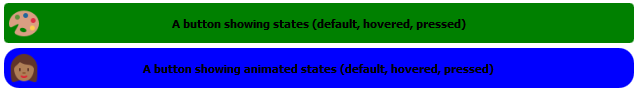
This button also contains several states (default, hover, pressed), and the transition between each states is animated. I found a way to animate each properties easily with the Qt Quick engine, except for the image one. Indeed, I want to animate the image transition, by performing a crossfade between states.
However I couldn't found a such animator for images. The only way I found was to add 3 images to my button, one for each states, and to animate their respective opacity.
Below is the code for my buttons:
Button
{
    property bool hoveredBtn: false
    property bool pressedBtn: false

    id: btAnimStateDemo
    height: 40
    anchors.right: parent.right
    anchors.rightMargin: 5
    anchors.left: parent.left
    anchors.leftMargin: 5
    anchors.top: parent.top
    anchors.topMargin: 290
    state: "DEFAULT"

    // the button background
    background: Rectangle
    {
        id: btAnimStateDemoBg
        anchors.fill: parent
    }

    // the button text
    Text
    {
        id: btAnimStateDemoText
        text: qsTr("A button showing animated states (default, hovered, pressed)")
        renderType: Text.NativeRendering
        font.bold: true
        horizontalAlignment: Text.AlignHCenter
        verticalAlignment: Text.AlignVCenter
        anchors.fill: parent
    }

    Image
    {
        id: btAnimStateDemoDefaultImage
        width: 30
        height: 30
        anchors.left: parent.left
        anchors.leftMargin: 5
        anchors.bottom: parent.bottom
        anchors.bottomMargin: 5
        anchors.top: parent.top
        anchors.topMargin: 5
        opacity: 1.0
        source: "Resources/Palette.svg"
    }

    Image
    {
        id: btAnimStateDemoHoverImage
        width: 30
        height: 30
        anchors.left: parent.left
        anchors.leftMargin: 5
        anchors.bottom: parent.bottom
        anchors.bottomMargin: 5
        anchors.top: parent.top
        anchors.topMargin: 5
        opacity: 0.0
        source: "Resources/Smile.svg"
    }

    Image
    {
        id: btAnimStateDemoPressedImage
        width: 30
        height: 30
        anchors.left: parent.left
        anchors.leftMargin: 5
        anchors.bottom: parent.bottom
        anchors.bottomMargin: 5
        anchors.top: parent.top
        anchors.topMargin: 5
        opacity: 0.0
        source: "Resources/Woman.svg"
    }

    // the component state array
    states:
    [
        State
        {
            name: "DEFAULT"
            PropertyChanges { target: btAnimStateDemoBg; color: "green"}
            PropertyChanges { target: btAnimStateDemoBg; radius: 4}
            PropertyChanges { target: btAnimStateDemoDefaultImage; opacity: 1.0}
            PropertyChanges { target: btAnimStateDemoHoverImage; opacity: 0.0}
            PropertyChanges { target: btAnimStateDemoPressedImage; opacity: 0.0}
        },
        State
        {
            name: "HOVERED"
            PropertyChanges { target: btAnimStateDemoBg; color: "red"}
            PropertyChanges { target: btAnimStateDemoBg; radius: 10}
            PropertyChanges { target: btAnimStateDemoDefaultImage; opacity: 0.0}
            PropertyChanges { target: btAnimStateDemoHoverImage; opacity: 1.0}
            PropertyChanges { target: btAnimStateDemoPressedImage; opacity: 0.0}
        },
        State
        {
            name: "PRESSED"
            PropertyChanges { target: btAnimStateDemoBg; color: "blue"}
            PropertyChanges { target: btAnimStateDemoBg; radius: 15}
            PropertyChanges { target: btAnimStateDemoDefaultImage; opacity: 0.0}
            PropertyChanges { target: btAnimStateDemoHoverImage; opacity: 0.0}
            PropertyChanges { target: btAnimStateDemoPressedImage; opacity: 1.0}
        }
    ]

    // the matching transitions between states
    transitions:
    [
        Transition
        {
            from: "*"; to: "DEFAULT"
            ColorAnimation { property: "color"; easing.type: Easing.Linear; duration: 1000 }
            NumberAnimation { properties: "radius, opacity"; easing.type: Easing.Linear; duration: 1000 }
        },
        Transition
        {
            from: "*"; to: "HOVERED"
            ColorAnimation { property: "color"; easing.type: Easing.Linear; duration: 1000 }
            NumberAnimation { properties: "radius, opacity"; easing.type: Easing.Linear; duration: 1000 }
        },
        Transition
        {
            from: "*"; to: "PRESSED"
            ColorAnimation { property: "color"; easing.type: Easing.Linear; duration: 1000 }
            NumberAnimation { properties: "radius, opacity"; easing.type: Easing.Linear; duration: 1000 }
        }
    ]

    // the mouse area which will apply the correct state in relation to the current mouse status
    MouseArea
    {
        anchors.fill: parent
        hoverEnabled: true

        onEntered: {btAnimStateDemo.state = "HOVERED"; btAnimStateDemo.hoveredBtn = true;}
        onExited: {btAnimStateDemo.state = btAnimStateDemo.pressedBtn ? "PRESSED" : "DEFAULT"; btAnimStateDemo.hoveredBtn = false;}
        onPressed: {btAnimStateDemo.state = "PRESSED"; btAnimStateDemo.pressedBtn = true;}
        onReleased: {btAnimStateDemo.state = btAnimStateDemo.hoveredBtn ? "HOVERED" : "DEFAULT"; btAnimStateDemo.pressedBtn = false;}
    }
}
The above code works well, and reaches the purpose I planned, but is a little complicated from my point of view. It would be wonderful if an animator like NumberAnimation or ColorAnimation would exist for the images, but I found none.
It would be possible to add a such animator? (And eventually allow this animator to support several type of transition effects, like crossfade, morphing, ..., or even custom transitions?)
NOTE this issue is also followed here: