-
Bug
-
Resolution: Unresolved
-
 P2: Important
-
None
-
6.1.0, 6.1.2
-
Windows
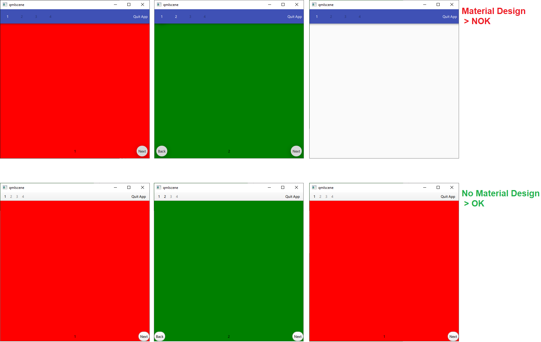
I noticed popEnter, pushEnter and replaceEnter transitions are not working correctly when using material style (import QtQuick.Controls.Material). New views are not presented.
No issues are detected when:
- no material style is used
- Qt5 is used
- no animation transitions are defined
Bellow i share a minimal script reproducing the issue. popEnter transition is defined.
Item views can be pushed into stack successfully pressing next button. When a view is popped, pressing back or pressing ToolButton. it is not visible.
/*
// QT5 ------------------------------------
import QtQuick 2.12
import QtQuick.Controls 2.12
import QtQuick.Layouts 1.15
import QtQuick.Controls.Material 2.12
*/

// QT6 ------------------------------------
import QtQuick
import QtQuick.Controls
import QtQuick.Layouts
import QtQuick.Controls.Material

ApplicationWindow {
    id: root
    width: 500
    height: 500

    header: ToolBar {
        RowLayout {
            id: headerRowLayout
            anchors.fill: parent
            spacing: 0

            ToolButton {
                text: "1"
                enabled: stack.depth >= 1
                onClicked: {
                    stack.pop(view1)
                    console.log(stack.depth)
                }
            }
            ToolButton {
                text: "2"
                enabled: stack.depth >= 2
                onClicked: {
                    stack.pop(view2)
                    console.log(stack.depth)
                }
            }
            ToolButton {
                text: "3"
                enabled: stack.depth >= 3
                onClicked: {
                    stack.pop(view3)
                    console.log(stack.depth)
                }
            }
            ToolButton {
                text: "4"
                enabled: stack.depth >= 4
                onClicked: {
                    stack.pop(view4)
                    console.log(stack.depth)
                }
            }

            Item {
                Layout.fillWidth: true
            }

            ToolButton {
                text: "Quit App"
                onClicked: Qt.quit()
            }
        }
    }


    StackView {
        id: stack
        initialItem: view1
        anchors.fill: parent


        /*
        popEnter:Transition {
            XAnimator {
                from: -stack.width
                to: 0
                duration: 2000
                easing.type: Easing.OutCubic
            }
        }
        popExit: Transition {
            XAnimator {
                from: 0
                to: stack.width
                duration: 2000
                easing.type: Easing.OutCubic
            }
        }
        */

        popEnter: Transition {
            PropertyAnimation {
                target: stack
                property: "opacity"
                from: 0
                to: 1
                duration: 1500
                easing.type: Easing.InOutElastic;
                easing.amplitude: 2.0;
                easing.period: 1.5
            }
        }
        popExit: Transition {
            PropertyAnimation {
                target: stack
                property: "opacity"
                from: 1
                to: 0
                duration: 500
                easing.type: Easing.InOutElastic;
                easing.amplitude: 2.0;
                easing.period: 1.5
            }
        }


        Component {
            id: stackPage
            Rectangle {
                id: stackPageView
                property alias page: pageLabel.text
                anchors.fill: parent

                RoundButton {
                    id: backButton
                    anchors {
                        bottom: parent.bottom;
                        left: parent.left;
                    }
                    text: "Back"
                    visible: stack.depth > 1
                    onClicked: stack.back()
                }

                Text {
                    id: pageLabel
                    anchors {
                        verticalCenter: backButton.verticalCenter;
                        horizontalCenter: parent.horizontalCenter;
                    }
                    text: "-"
                }

                RoundButton {
                    id: nextButton
                    anchors {
                        bottom: parent.bottom;
                        right: parent.right;
                    }
                    text: "Next"
                    visible: stack.depth < 4
                    onClicked: stack.next()
                }

            }
        }


        function back() {
            if (stack.depth > 1) {
                stack.pop();
                console.log(stack.depth)
            }
        }
        function next() {
            switch (stack.depth) {
                case 1:
                    stack.push(view2)
                    break
                case 2:
                    stack.push(view3)
                    break
                case 3:
                    stack.push(view4)
                    break
                default:
                    break
            }
            console.log(stack.depth)
        }

        Loader {
            id: view1
            sourceComponent: stackPage
            onLoaded: {item.color = "red"; item.page = "1"}
        }

        Loader {
            id: view2
            sourceComponent: stackPage
            onLoaded: {item.color = "green"; item.page = "2"}
        }

        Loader {
            id: view3
            sourceComponent: stackPage
            onLoaded: {item.color = "blue"; item.page = "3"}
        }

        Loader {
            id: view4
            sourceComponent: stackPage
            onLoaded: {item.color = "white"; item.page = "4"}
        }
    }

}