Uploaded image for project: 'Qt'
  1. Qt
  2. QTBUG-95593

Customised SpinBox buttons don't work with macOS style

    XMLWordPrintable

Details

    • macOS
    • 299c8f0deeafaa42d37eb1d53d7fe118b9e9eb7a (qt/qtdeclarative/dev) 4551ff5b043e0fc6b8fe34fa60123ebf7e57a05f (qt/qtdeclarative/6.2)

    Description

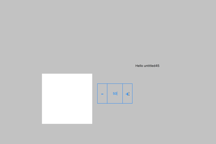
      Customizable spin box from QDS Wizard Template, plus and minus buttons don't work with the basic, default or macOS style.

      import QtQuick 2.12
      import QtQuick.Controls 2.12
      
      SpinBox {
          id: control
          value: 50
          editable: true
      
          contentItem: textInput
          TextInput {
              id: textInput
              z: 2
              text: control.value
      
              font: control.font
              color: "#047eff"
              selectionColor: "#047eff"
              selectedTextColor: "#ffffff"
              horizontalAlignment: Qt.AlignHCenter
              verticalAlignment: Qt.AlignVCenter
      
              readOnly: !control.editable
              validator: control.validator
              inputMethodHints: Qt.ImhFormattedNumbersOnly
          }
      
          up.indicator: upIndicator
      
          Rectangle {
              id: upIndicator
              x: control.mirrored ? 0 : parent.width - width
              height: parent.height
              color: "#00000000"
              implicitWidth: 40
              implicitHeight: 40
              border.color: "#047eff"
      
              Text {
                  id: text1
                  text: "+"
                  font.pixelSize: control.font.pixelSize * 2
                  color: "#047eff"
                  anchors.fill: parent
                  fontSizeMode: Text.Fit
                  horizontalAlignment: Text.AlignHCenter
                  verticalAlignment: Text.AlignVCenter
              }
          }
      
          down.indicator: downIndicator
          Rectangle {
              id: downIndicator
              x: control.mirrored ? parent.width - width : 0
              height: parent.height
              color: "#00000000"
              implicitWidth: 40
              implicitHeight: 40
              border.color: "#047eff"
      
              Text {
                  id: text2
                  text: "-"
                  font.pixelSize: control.font.pixelSize * 2
                  color: "#047eff"
                  anchors.fill: parent
                  fontSizeMode: Text.Fit
                  horizontalAlignment: Text.AlignHCenter
                  verticalAlignment: Text.AlignVCenter
              }
          }
      
          background: backgroundRect
          Rectangle {
              id: backgroundRect
              color: "#00000000"
              implicitWidth: 140
              border.color: "#047eff"
          }
          states: [
              State {
                  name: "normal"
                  when: !control.down.pressed && !control.up.pressed
                        && control.enabled
      
                  PropertyChanges {
                      target: upIndicator
                      border.color: "#047eff"
                  }
      
                  PropertyChanges {
                      target: downIndicator
                      border.color: "#047eff"
                  }
      
                  PropertyChanges {
                      target: backgroundRect
                      border.color: "#047eff"
                  }
      
                  PropertyChanges {
                      target: textInput
                      color: "#047eff"
                      selectionColor: "#ffffff"
                  }
      
                  PropertyChanges {
                      target: text1
                      color: "#047eff"
                  }
      
                  PropertyChanges {
                      target: text2
                      color: "#047eff"
                  }
              },
              State {
                  name: "upPressed"
                  when: control.up.pressed
      
                  PropertyChanges {
                      target: text1
                      color: "#ffffff"
                  }
      
                  PropertyChanges {
                      target: upIndicator
                      color: "#047eff"
                      border.color: "#047eff"
                  }
      
                  PropertyChanges {
                      target: textInput
                      color: "#047eff"
                      selectionColor: "#ffffff"
                  }
      
                  PropertyChanges {
                      target: downIndicator
                      border.color: "#047eff"
                  }
      
                  PropertyChanges {
                      target: text2
                      color: "#047eff"
                  }
      
                  PropertyChanges {
                      target: backgroundRect
                      border.color: "#047eff"
                  }
              },
              State {
                  name: "downPressed"
                  when: control.down.pressed
      
                  PropertyChanges {
                      target: text2
                      color: "#ffffff"
                  }
      
                  PropertyChanges {
                      target: downIndicator
                      color: "#047eff"
                      border.color: "#047eff"
                  }
      
                  PropertyChanges {
                      target: textInput
                      color: "#047eff"
                      selectionColor: "#ffffff"
                  }
      
                  PropertyChanges {
                      target: upIndicator
                      border.color: "#047eff"
                  }
      
                  PropertyChanges {
                      target: text1
                      color: "#047eff"
                  }
      
                  PropertyChanges {
                      target: backgroundRect
                      border.color: "#047eff"
                  }
              },
              State {
                  name: "disabled"
                  when: !control.enabled
      
                  PropertyChanges {
                      target: downIndicator
                      border.color: "#b3047eff"
                  }
      
                  PropertyChanges {
                      target: upIndicator
                      border.color: "#b3047eff"
                  }
      
                  PropertyChanges {
                      target: textInput
                      color: "#b3047eff"
                  }
      
                  PropertyChanges {
                      target: text1
                      color: "#b3047eff"
                  }
      
                  PropertyChanges {
                      target: text2
                      color: "#b3047eff"
                  }
      
                  PropertyChanges {
                      target: backgroundRect
                      border.color: "#b3047eff"
                  }
              }
          ]
      }


      Attachments

        Issue Links

          No reviews matched the request. Check your Options in the drop-down menu of this sections header.

          Activity

            People

              richard Richard Moe Gustavsen
              brook_cronin_qt Brook Cronin
              Votes:
              0 Vote for this issue
              Watchers:
              4 Start watching this issue

              Dates

                Created:
                Updated:
                Resolved: