-
Suggestion
-
Resolution: Done
-
 Not Evaluated
-
None
-
None
-
All currently supported platforms
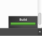
Whether it is building, running or configuring a project Qt Creator has a small notification popup at the bottom right corner like in the screenshot below:
I
If the given output pane (Issues, Search Results, Application Output etc. at the bottom of the IDE) has a lot of lines of text its scrollbar gets smaller. At this point it is nice to see that the scrollbar cannot go below a specific size, which is definitely a well thought decision from a UI design perspective.
However for the last couple of days I have been dealing with a large output from my application and this revealed an UI issue (at least an issue for me). The problem I'm seeing here (even after so many years of using Qt Creator it just revealed itself in front of my eyes) is that the notification covers the scrollbar.
This can become a problem if the user wants to actually use the scrollbar in order to scroll through the given output in the selected pane as fast as possible. This is not possible with scrolling or using the Page Up/Down keys. It is also what the scrollbar is basically there for.
I have also noticed that the notification
- has a relatively long timeout for hiding (when building/running a project but strangely enough not when configuring it). This forces the user to wait until the notification is no longer being displayed in order to effortlessly interact with the scrollbar
- changes to a preset pane when clicked (for example if it notifies you about the building process clicking on it will automatically open the Compile Output pane)
Both points from above (especially the second) remind me of the Windows 10 notifications, which are even less usable (you have to pixel-hunt for that tiny X button in order to close a notification; otherwise it stays there forever or at least for many, many minutes to follow).
My suggestion is to at least allow using the scrollbar while the notification is being displayed. This can be achieved by literally moving the notification a couple of centimeters to the left so that it will uncover the scrollbar. Right now (as you can see in the screenshot above) there is a very small bit of that scrollbar, which - if you have a very high res monitor - is close to pixel hunting.
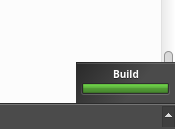
Here is how I imagine it to look:
This will not affect the current functionality of the notification (if someone uses the clicking event) but also allows the user to have full access to (both visually and in terms of actually interacting with) the scrollbar.
| For Gerrit Dashboard: QTCREATORBUG-19308 | ||||||
|---|---|---|---|---|---|---|
| # | Subject | Branch | Project | Status | CR | V |
| 215594,2 | Attach progress details to the toggle progress details button | master | qt-creator/qt-creator | Status: MERGED | +2 | 0 |

