-
Suggestion
-
Resolution: Unresolved
-
 P3: Somewhat important
-
None
-
Qt Creator 11.0.0
-
None
-
All
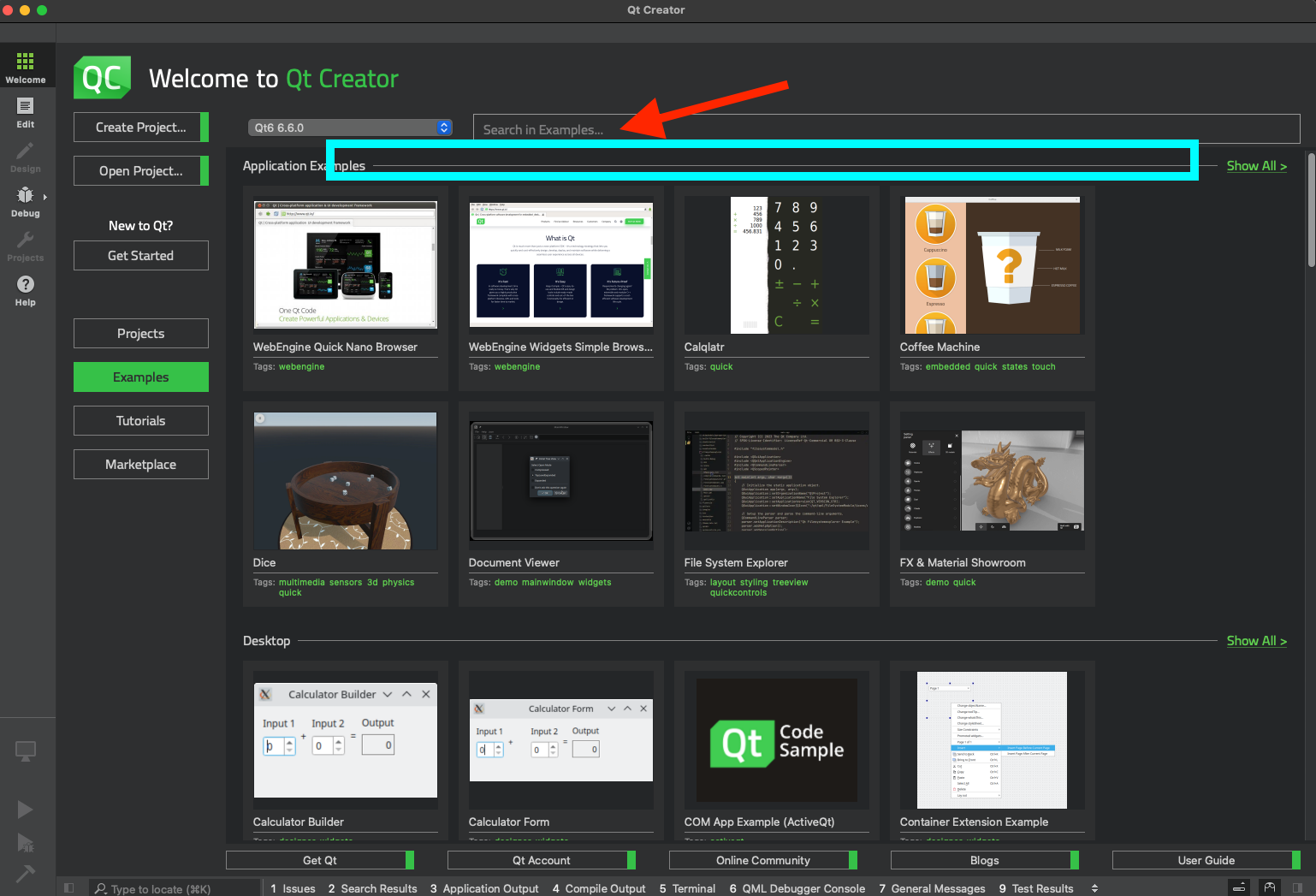
The new categories and highlights are good improvements for the Welcome screen, While categories are self-explainatory. Highlghts, ways of search, and search results are not clear when users just have Welcome screen in the front of them. So, suggestions
- Use and replace the current place holder text "Search in Examples..." (red arrow in the screenshot) as a way to tell people how to use search, e.g. that it is possible to use "tag:XYZ" to search for tags
- Alternatively, add a longer text label (cyan rectangle in the screenshot) just below the text box for search with details for the prev. and the next points in this list
- Explain how results are sorted, IIRC, it is alphabetical, ATM, right? This is not clear ATM
- relates to
-
-
- In Progress
-