-
Bug
-
Resolution: Done
-
 Not Evaluated
-
3.1.0
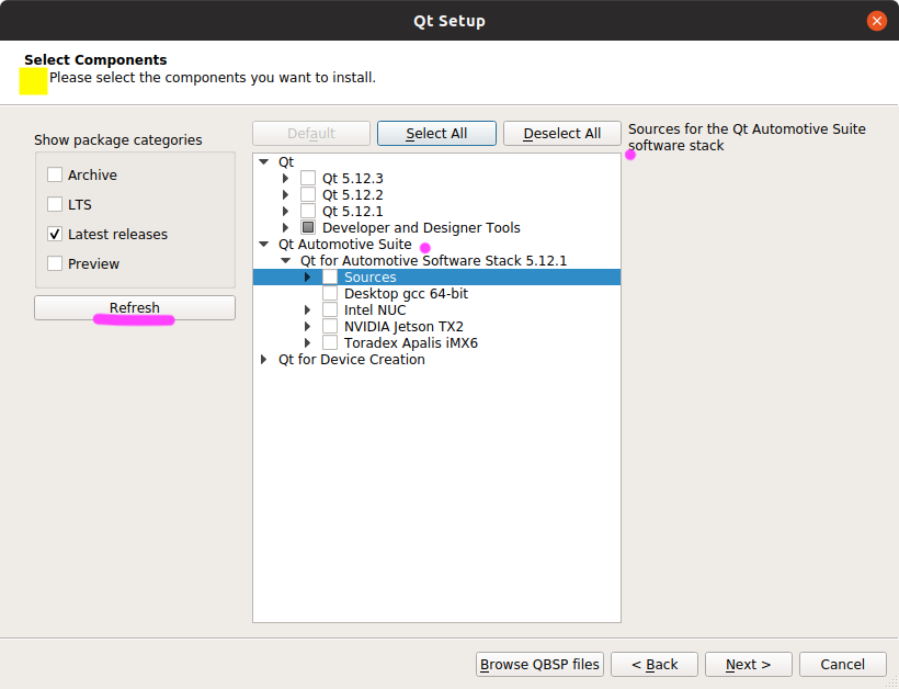
In the attached screenshot:
- There's a weird space between the first headline and the second one. This misalignment is jarring, and annoys the reader, especially if you're used to seeing properly designed UIs where all text is aligned accordingly.
- The "Refresh" button should actually be renamed to "Filter", because you select the checkbox and then you click "Filter". Otherwise, it seems like you're just refreshing your connection to the server, which isn't intuitive.
- "LTS" should be expanded to it's long form "Long Term Support (LTS)" . Remember that your customer is not always a Qt expert, write with empathy.
- The word "Software" in "Qt Automotive Suite Software Stack" vs. the description on the right side do not have the same capitalisation. Either you capitalize both, or you don't.
- is required for
-
 QTIFW-1335
Qt Installer UI improvements
QTIFW-1335
Qt Installer UI improvements
-

- Closed
-
-
 QTIFW-1369
Installer 3.2.0 release
QTIFW-1369
Installer 3.2.0 release
-
- Closed
-