-
Suggestion
-
Resolution: Fixed
-
 Not Evaluated
-
None
-
-
82f1805a4 (master)
-
Qt Installer Sprint 87
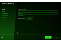
The new Qt Maintenance tool has a real ugly color composition!
Please return to color schemes that look adult.
Maybe use the theme / palette of the operating system?

Much to much visual noise:
- Light green much too light
- color gradient to long and to steep
- "vertical" bar is not vertical
All this sums up to a brain trying to visually fix this. And this hurts after a few seconds.
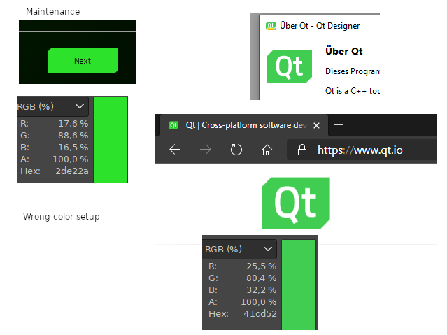
The "green" in the setup does not match the green of the Qt home page and the designer icon color:

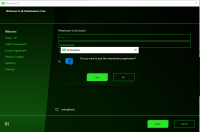
And when you press cancel:

Can your see, where the "Qt Question" (btw. a childish dialog title) dialog window has its border... Hardly, the background is melting with the background of the dialog.
And the question mark is blue.
Seems to be the most important attraction, as it is a ... well ... a "Qt question", so we should give it a color that really pops out...
Please go back to the color and design that you had before.
And maybe give your design artist a break.


