-
Suggestion
-
Resolution: Fixed
-
 Not Evaluated
-
None
-
None
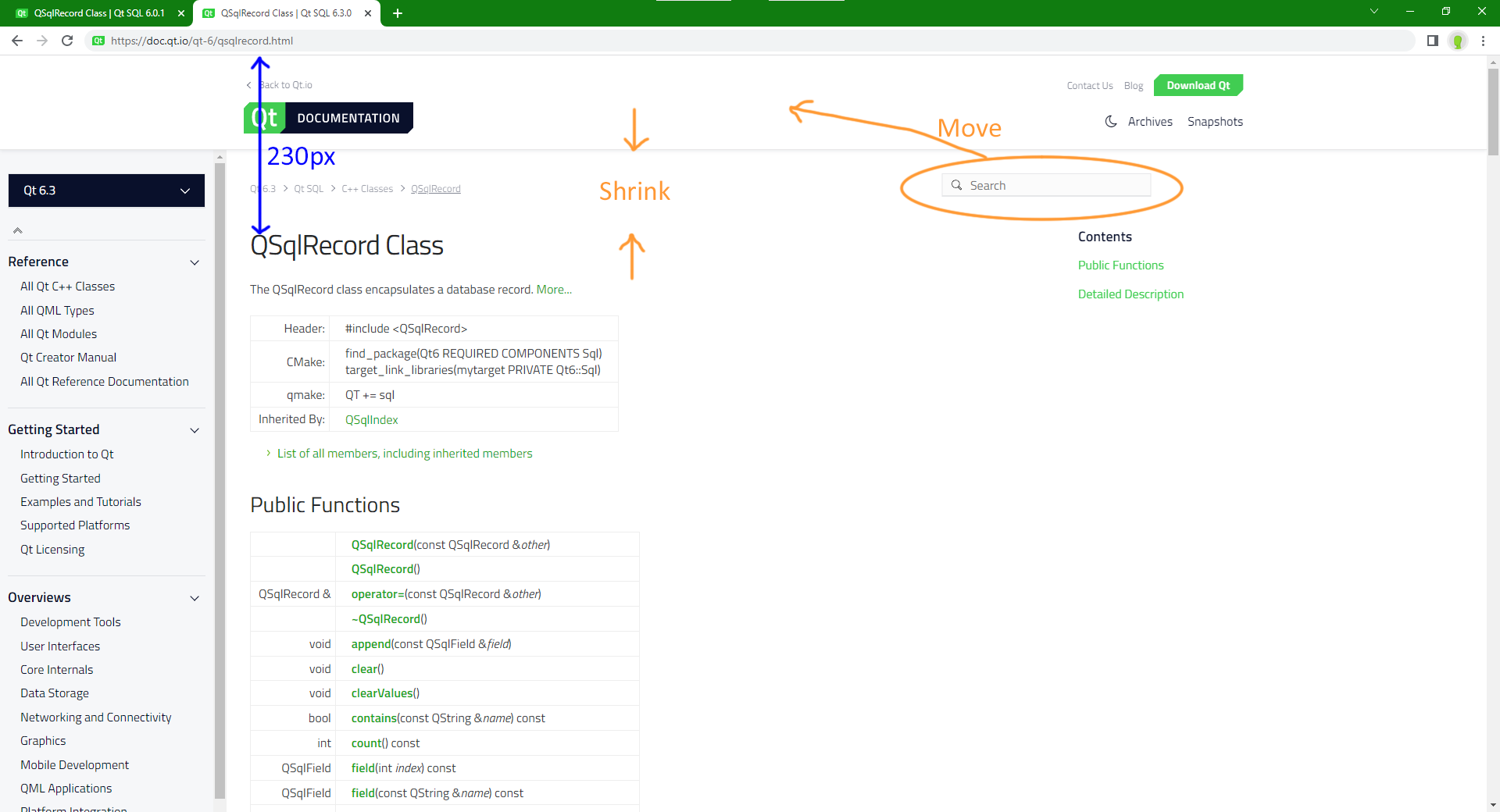
The new documentation layout provides more horizontal and vertical reading space in general, which is great.
This is currently offset by the enlarged header: users must scroll further to see content. May I suggest reducing the vertical whitespace at the top of the page? (possibly helped by moving the search bar – see annotated screenshot)