-
Bug
-
Resolution: Won't Do
-
P4: Low
-
None
-
None
-
None
-
Web browser
The new API documentation webpage (example: http://doc.qt.io/qt-5/qgraphicsview.html) is inferior to the old documentation page (example: http://qt-project.org/doc/qt-4.8/qgraphicsview.html)
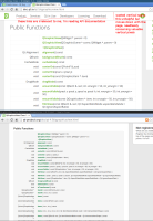
There is a toolbar on the new API docs that remains at the top of the browser's view of the page, regardless of how far down the page is scrolled. This toolbar consumes 50 pixels of vertical space, but does not contain any relevant information to API documentation. For example, none of the links provided in the toolbar are important enough that I would ever need to click them while in the middle of reading about the particulars of QGraphicsView::drawForeGround().
On screens with limited vertical real estate, this 50 pixels is a gratuitous waste. Developers would rather see more documentation than silly toolbars with fancy drop-shadows.
Furthermore, the font size has been increased, which decreases the quantity of relevant information visible on the screen at a given point in time.
Please see the attached picture. The API documentation on the bottom is preferable, since there is more information visible without scrolling or Control-F searching.
If there is a specific rationale for the design changes, I'd love to hear them.
Or if I am using the new website incorrectly, some guidance would be appreciated.
Unfortunately, it appears that the changes are simply change for change's sake.
