-
Suggestion
-
Resolution: Duplicate
-
 Not Evaluated
-
None
-
None
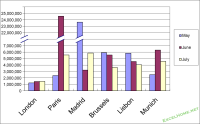
By "break" I mean something like the attached graph. The y-axis has its "break" to compress the range. Also, the corresponding part of data of "Paris" and "Madrid" is also compressed so that it fits better with the rest.
I'd say it is a common use case in statistics but there is yet no such API in charts/graphs module.
