-
Bug
-
Resolution: Done
-
P2: Important
-
5.7.0 Alpha
-
None
-
qtdeclarative: fe10cee6265f068bf0da03895c0c7c5680dc36a5
In Qt 5.7 I should use contentItem instead of label. The following code not works:
ToolButton {
    contentItem: Image {
        anchors.centerIn: parent
        source: "icon.png"
    }
}
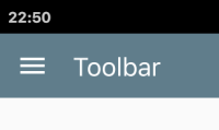
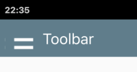
The image is stretched to button size, which could be bigger (for example, 48x48). In the gallery example, fillMode: Image.Pad added to Image. It seems to work, but only on my desktop.
On my phone with ~320 dpi screen and auto hidpi scaling enabled (resulting in 2x scaling) the image is either stretched, or stretched and has wrong position (when fillMode: Image.Pad is used).
The solution/workaround is to wrap it into Item and center on parent:
ToolButton {
    contentItem: Item {
        Image {
            anchors.centerIn: parent
            source: "icon.png"
        }
    }
}
The fillMode: Image.Pad should not be used here as the icon would be broken again.
Not sure, is it intended behaviour or not, but as gallery example is broken, I decided to create BR.
BTW, icon images in gallery is 20x20. I don't know, what size should be for other themes, but for Material it should be 24x24. Here file selectors based on theme would help ![]()
- depends on
-
QTBUG-52043 Using Image.Pad with AA_EnableHighDpiScaling results in scaling; blurry images
-
- Closed
-


