Uploaded image for project: 'Qt'
  1. Qt
  2. QTBUG-78698

Improve display of default docker icons

    XMLWordPrintable

Details

    • Suggestion
    • Resolution: Unresolved
    • Not Evaluated
    • None
    • None
    • GUI: Look'n'Feel
    • None
    • I am seeing it on Windows 10 x64 right now with the applications. I know at least Krita is using a pretty up to date version of Qt5.

    Description

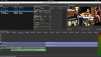
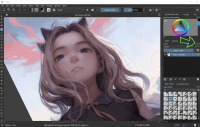
      This is kind of minor, but I think it would be a good usability improvement. I have noticed at least two applications that are using these icons for the dockers. The current icons are quite difficult to read in the current state. Is there any way to improve the design?

      There might be others, but I specifically see the "float" and the "close" icons that could be improved.

      One solution might just be to remove that box that goes around the icon images. The images are quite small, so it makes it difficult to read the contents inside.


      I attached a couple applications that are currently using these. I pointed the area out in the Krita application screenshot.
       

      Attachments

        1. restore.xpm
          0.3 kB
        2. olive-editor.jpg
          olive-editor.jpg
          303 kB
        3. krita-screenshot.jpg
          krita-screenshot.jpg
          142 kB
        4. close.xpm
          0.3 kB
        No reviews matched the request. Check your Options in the drop-down menu of this sections header.

        Activity

          People

            qt.team.quick.subscriptions Qt Quick and Widgets Team
            scottpetrovic scottpetrovic
            Votes:
            0 Vote for this issue
            Watchers:
            1 Start watching this issue

            Dates

              Created:
              Updated:

              Gerrit Reviews

                There are no open Gerrit changes