Details
-
Suggestion
-
Resolution: Unresolved
-
 Not Evaluated
-
None
-
None
-
None
-
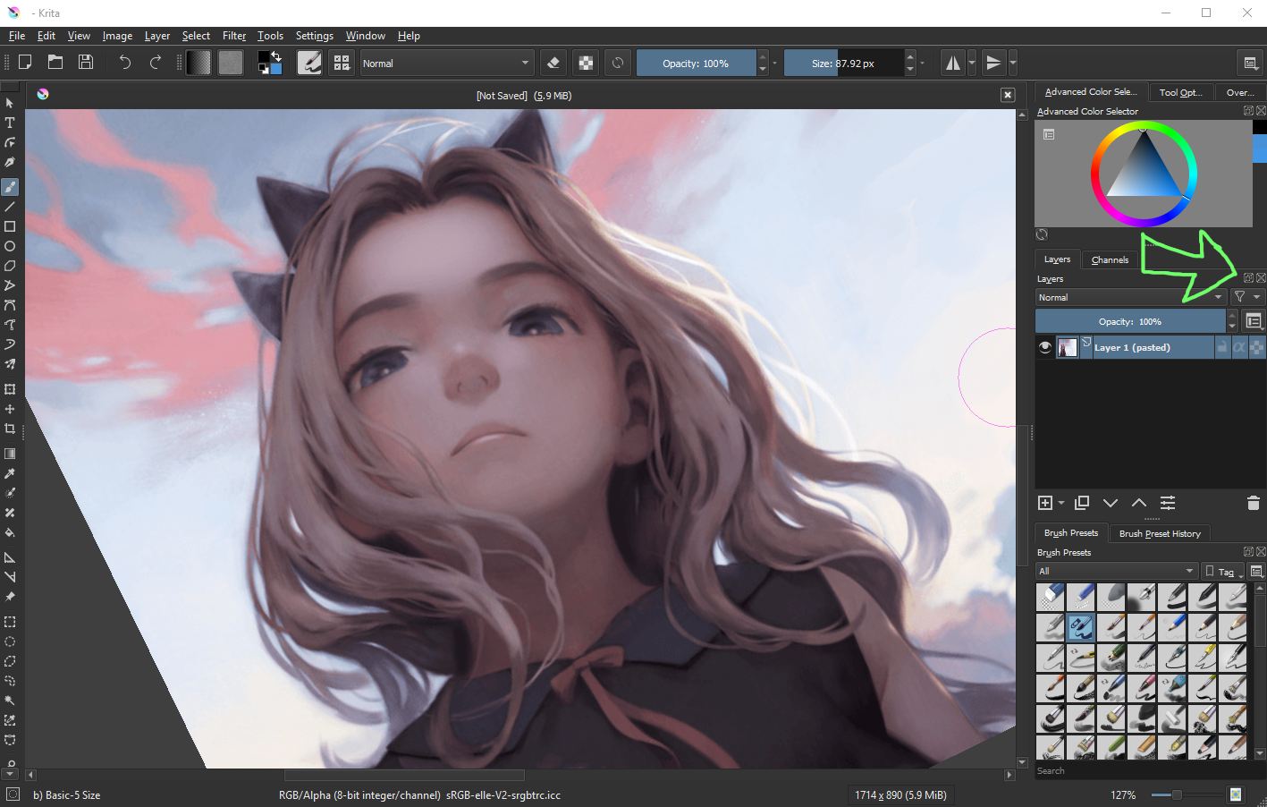
I am seeing it on Windows 10 x64 right now with the applications. I know at least Krita is using a pretty up to date version of Qt5.
Description
This is kind of minor, but I think it would be a good usability improvement. I have noticed at least two applications that are using these icons for the dockers. The current icons are quite difficult to read in the current state. Is there any way to improve the design?
There might be others, but I specifically see the "float" and the "close" icons that could be improved.
One solution might just be to remove that box that goes around the icon images. The images are quite small, so it makes it difficult to read the contents inside.
I attached a couple applications that are currently using these. I pointed the area out in the Krita application screenshot.