-
Suggestion
-
Resolution: Unresolved
-
P3: Somewhat important
-
None
-
Qt Creator 3.6.0, Qt Creator 4.0.0-beta1, Qt Creator 4.3.0
-
None
-
Ubuntu Mate, 64bit
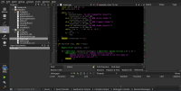
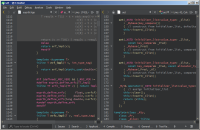
In the dark theme the scrollbars have a too low contrast.
When not using the "dark" color scheme in the editor the white background of the editor over-shines the contrast of the slider to the background of the scrollbar completely.
When using "dark" color scheme in the editor it relaxes a bit. But in my eyes it is still to low in contrast.
Specially if you use the features of the marks in the scrollbars about warnings, error, or search results it is often difficult to find the slider to grab it with the mouse or just orient, where you are in the document.
Please have a look at the attached screenshot and try to find quickly in what part of the document in the editor you are. Scroll to the compile error...
Is the line with error above or below the current shown part of the document?
How about using the background color of selection in the project tree view?
- duplicates
-
QTCREATORBUG-25707 Dark theme: ScrollBar's handle is too dark.
-
- Reported
-
-
QTCREATORBUG-19720 Scrollbar cursor invisible in dark mode
-

- Closed
-
-
QTCREATORBUG-20478 dark flat theme: scrollbar "knob" is too hard to see
-
- Closed
-
- replaces
-
QTCREATORBUG-15448 Bad contrast for the scrollbar with the black theme
-

- Closed
-
-
QTCREATORBUG-20739 Vertical scrollbar on dark themes is difficult to see
-

- Closed
-
- resulted in
-
QTCREATORBUG-23505 Improve visibility of (some) widgets with "dark" themes
-

- Reported
-

