-
Bug
-
Resolution: Duplicate
-
P3: Somewhat important
-
None
-
Qt Creator 4.6.1
-
None
-
Linux
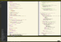
There just isn't enough contrast, so especially on hi-dpi screens I have a hard time seeing where I am in a file when I use this theme. The thin outlines of the knob aren't very visible, so IMO it's more important for the middle part of the knob to have more contrast against the scrollbar's background color.
- is duplicated by
-
QTCREATORBUG-15865 Dark theme scollbars have too low contrast
-
- Reported
-
