-
Bug
-
Resolution: Fixed
-
P2: Important
-
6.7.2
-
None
-
-
3babe8c73 (14.0), d205844e5 (dev), 075b4d1eb (6.9), 7158a577a (tqtc/lts-6.8)
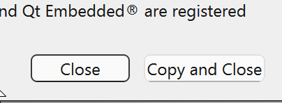
Consider this screencast from Qt Creator 14's about dialog:

Notice that the focus rectangle is only seen at the corners of the buttons.
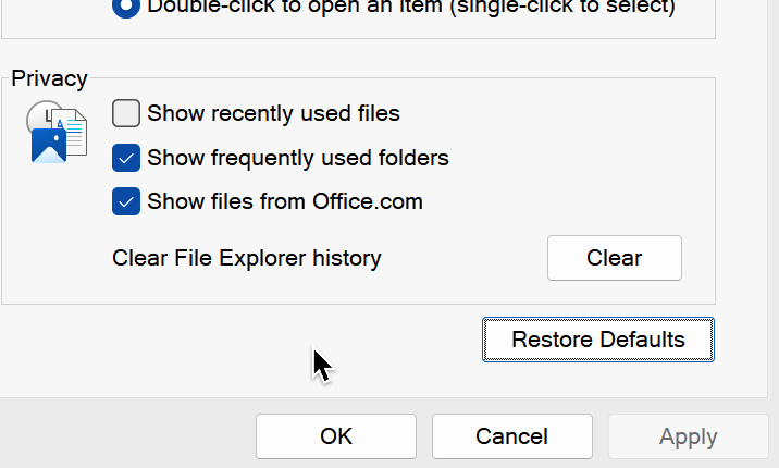
Now have a look at how Windows Explorer's settings dialog looks like:

The buttons are less rounded, but still rounded, and the focus rectangle is inside the button!
This would explain why the Qt Creator's buttons seem so stretched.
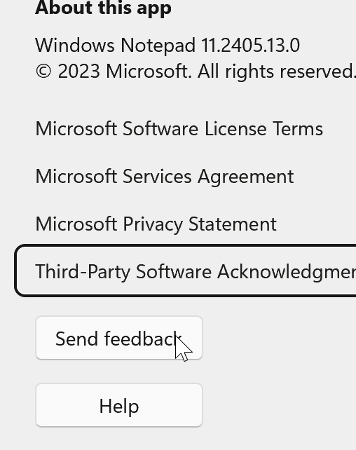
Lastly here is a screencast from the Windows Notepad where the focus is around the buttons:

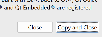
Qt Creator started with -style windowsvista:

This looks like the Windows Explorer above, and doesn't look like having small buttons at all.
- relates to
-
QTBUG-126548 Qt Creator 14 doesn't look well with the new Windows 11 Style in Qt 6.7
-
- Reported
-
-
QTBUG-126549 Issues with Windows 11 style (Qt 6.7)
-
- Closed
-
- mentioned in
-
Page Loading...
| For Gerrit Dashboard: QTBUG-126515 | ||||||
|---|---|---|---|---|---|---|
| # | Subject | Branch | Project | Status | CR | V |
| 568741,4 | App: Set "windowsvista" style on Windows | 14.0 | qt-creator/qt-creator | Status: MERGED | +2 | 0 |
| 642151,2 | Windows11Style: fix drawing PE_FrameFocusRect | dev | qt/qtbase | Status: ABANDONED | 0 | 0 |
| 642153,2 | Windows11Style: make QPushButton a little bit wider | dev | qt/qtbase | Status: MERGED | +2 | 0 |
| 645004,2 | Windows11Style: make QPushButton a little bit wider | 6.9 | qt/qtbase | Status: MERGED | +2 | 0 |
| 645391,2 | Windows11Style: make QPushButton a little bit wider | tqtc/lts-6.8 | qt/tqtc-qtbase | Status: MERGED | +2 | 0 |